CATALOG: TUNNEL VISION CLOTHING CO.
Publication Design Fall 2023
Tunnel Vision is a small business based out of Los Angeles, California that sells both handcurated vintage finds and a house brand of the same name. The brand gained popularity during the rise of TikTok due to its bright, unique, L.A. streetwear designs and its affordable pricing and ethical business model.
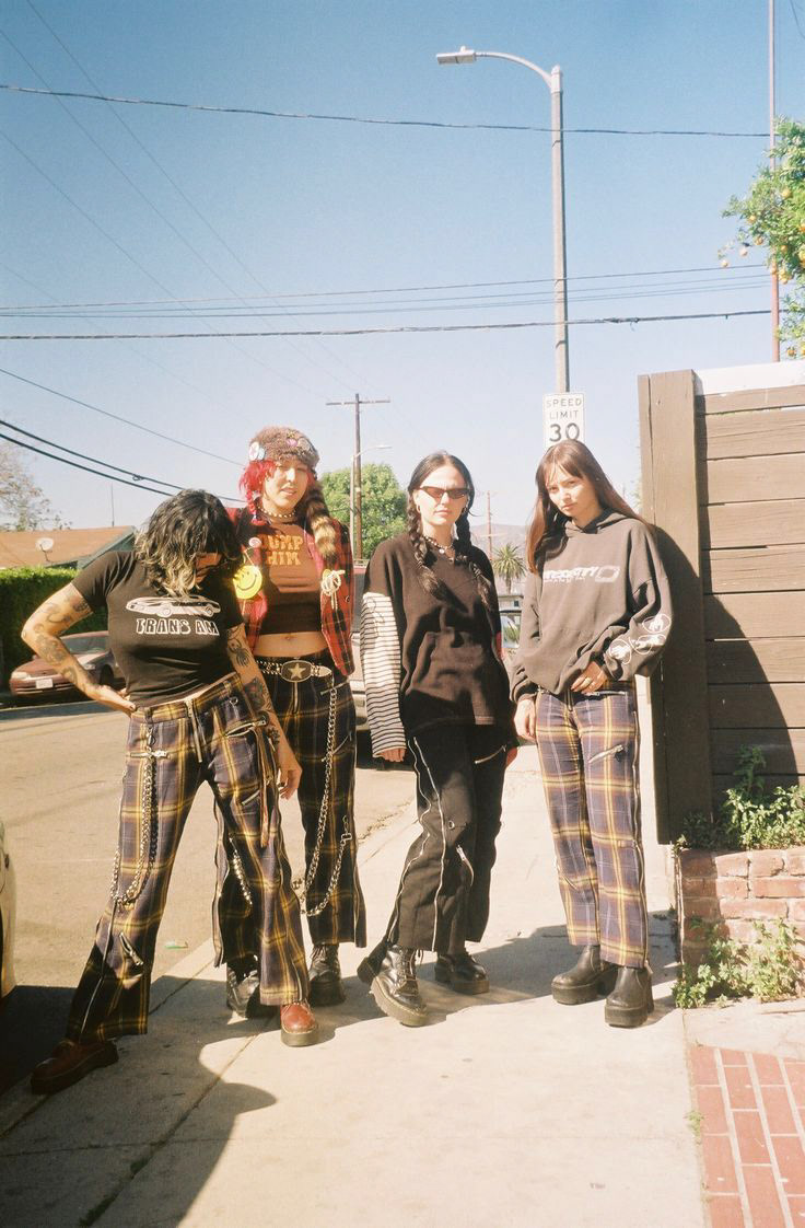
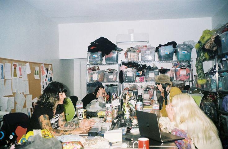

Tunnel Vision is a very small, urban team, owned by an anarchist LA native, which allows them a degree of creative freedom that isn't observed by a lot of brands their size. I've always loved Tunnel Vision's brand, even if I can't pull off most of what they sell, so I was excited to be awarded the opportunity to create the perfect print companion to their punky go lucky house style.


Tunnel Vision has an insane amount of inventory, so my first step towards content planning was poring over their entire website, curating which items represented the best of their house brand. I had to make sure I had enough variety of products selected, and I think I ended up with detailed information on at least 25 pieces (spoiler alert: there aren't 25 products in my catalog). This process also involved collecting product photography and making sure I was able to procure high quality photos, as well as scouring the site for anything written by the brand about their vision, story, policies, T&C, etc.
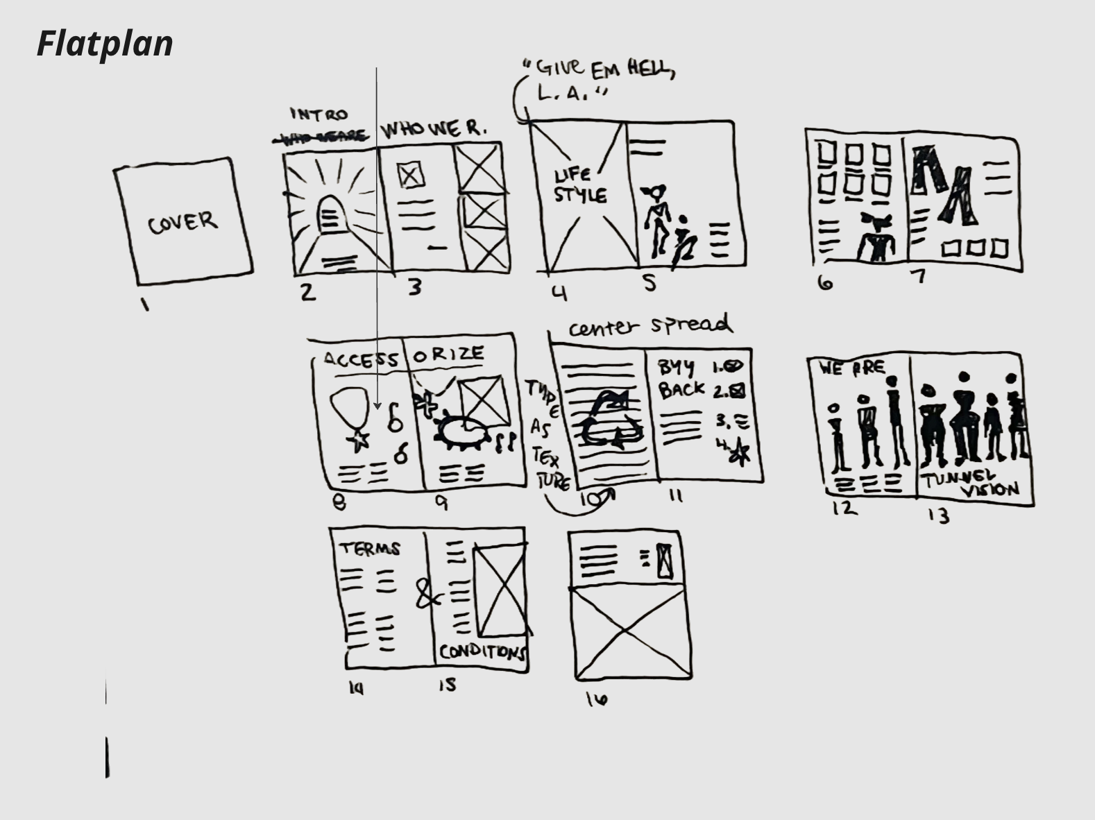
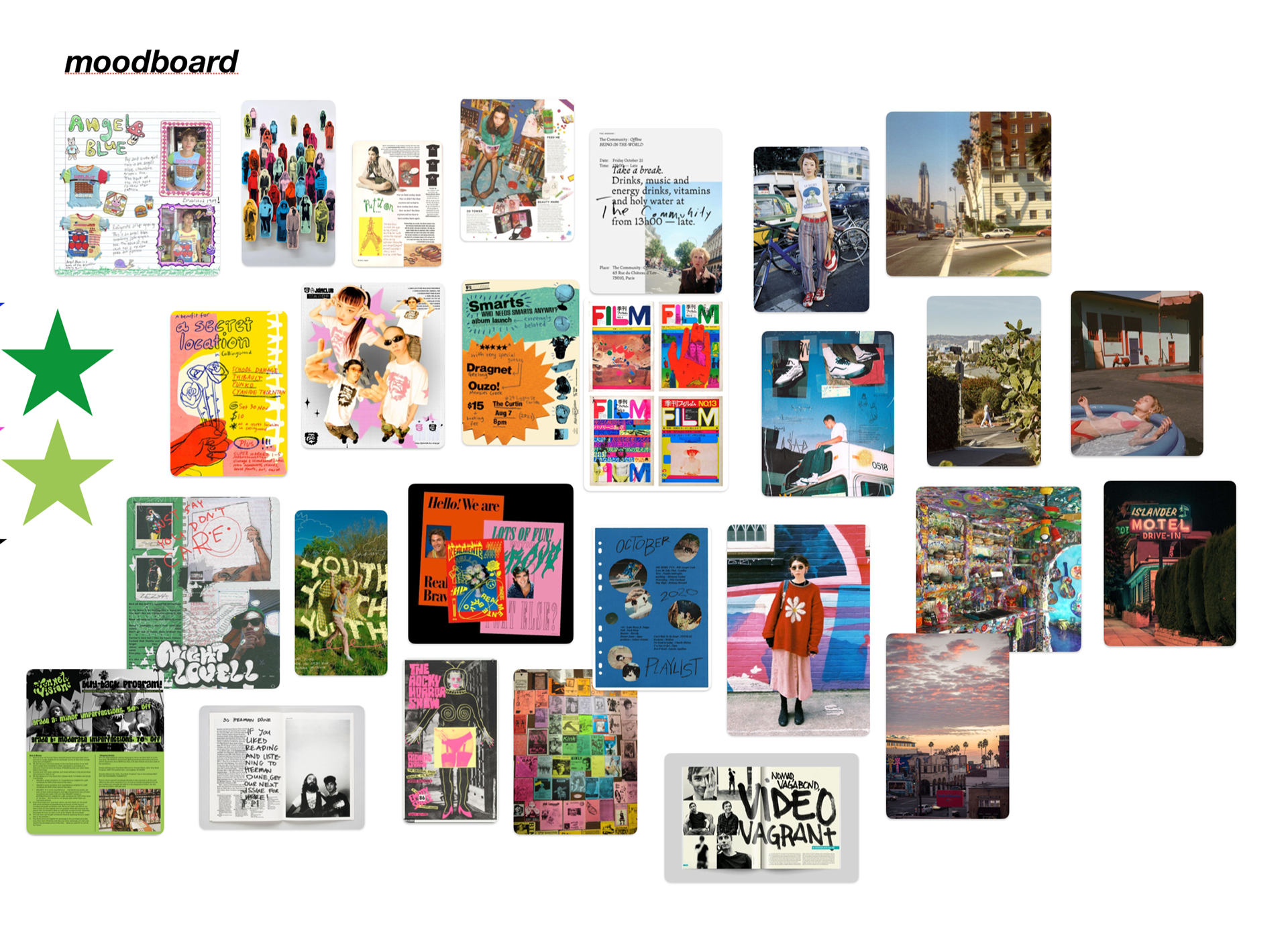
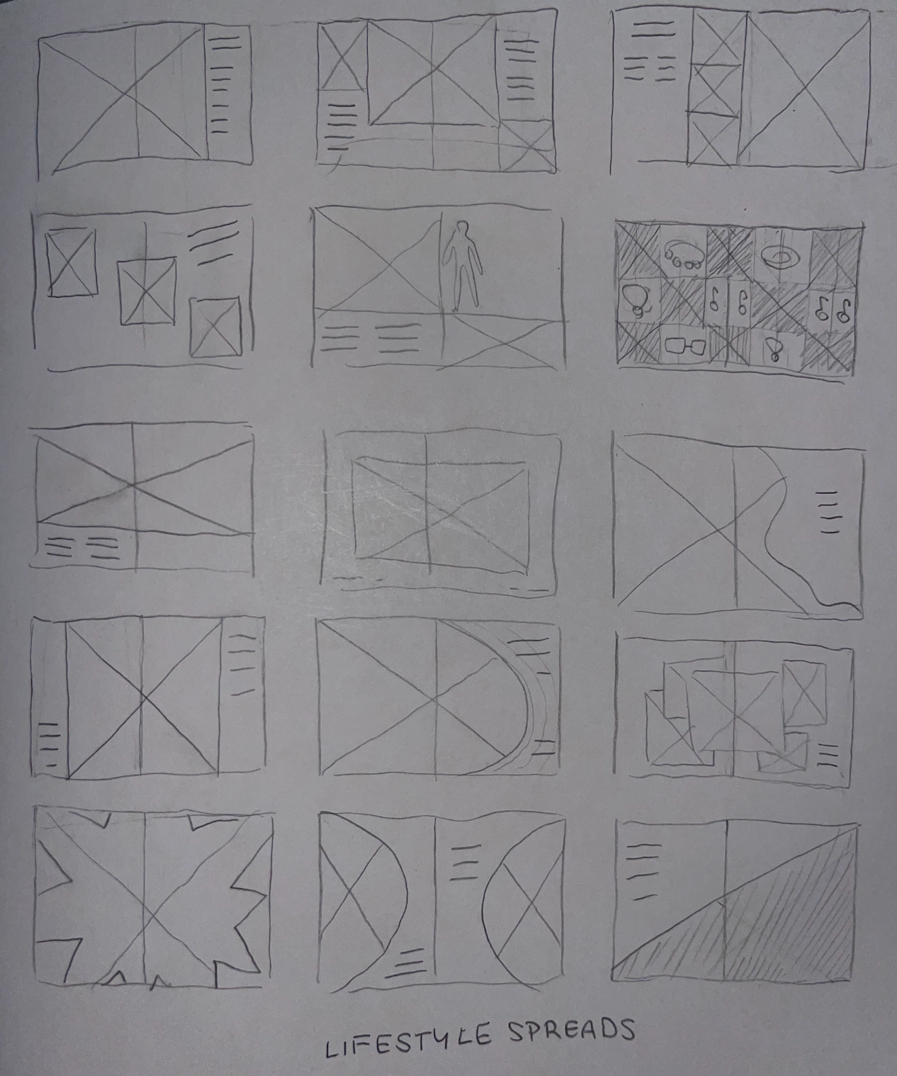
After that process was over, it was time to start considering catalog layout. I created both a flatplan and a more detailed dummy proof, trying to find the best flow, figure out how to fit everything I wanted to include as well as meeting all of my project requirements. As every design student looks forward to, I made an extensive set of moodboards.
An essential part of any publication design is finding the perfect typography system, and we had a fine-tuned system of checks imprinted upon us by our professor. I had to curate my own typography system rather than pulling from the existing brand because the type choices on their website simply weren't compatible with publication (monospaced and condensed, total double whammy).
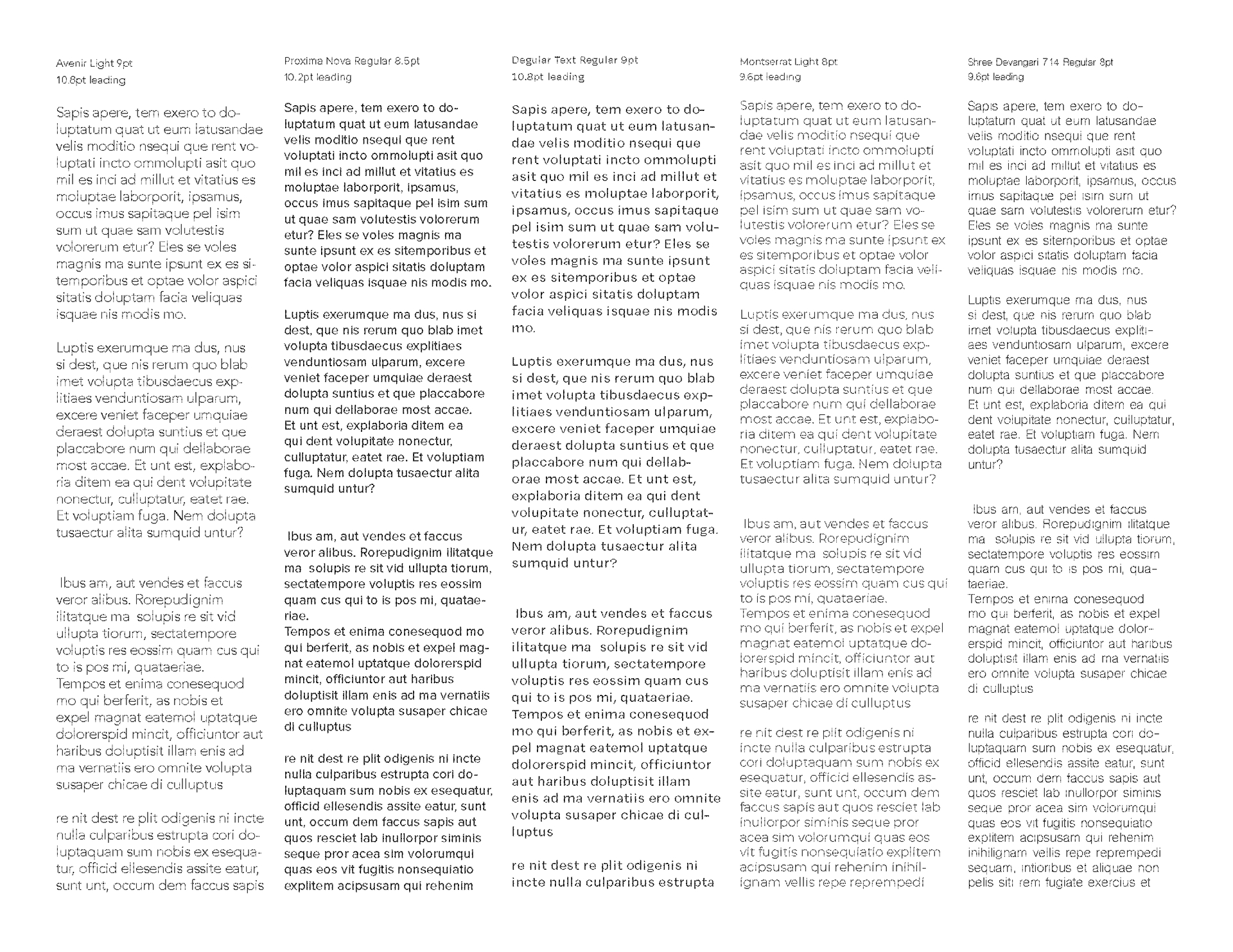
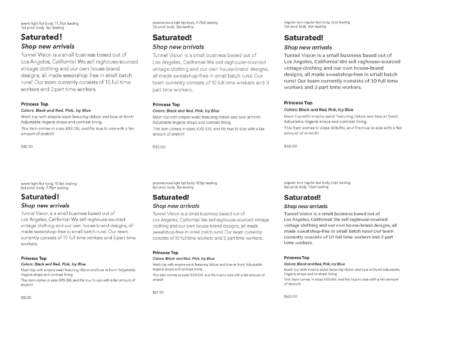
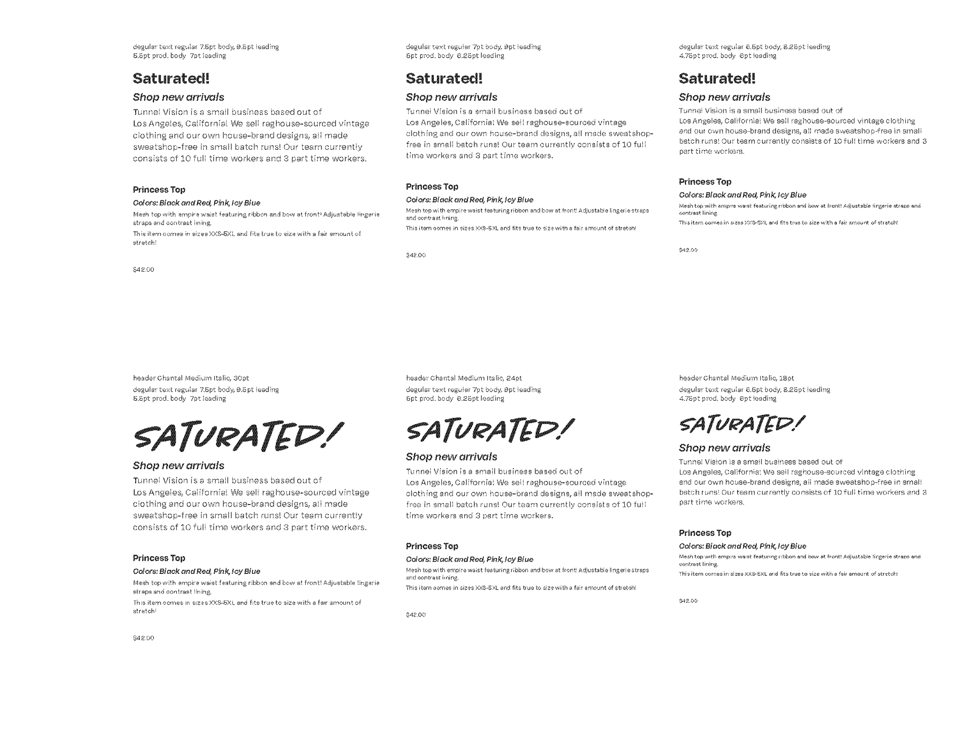
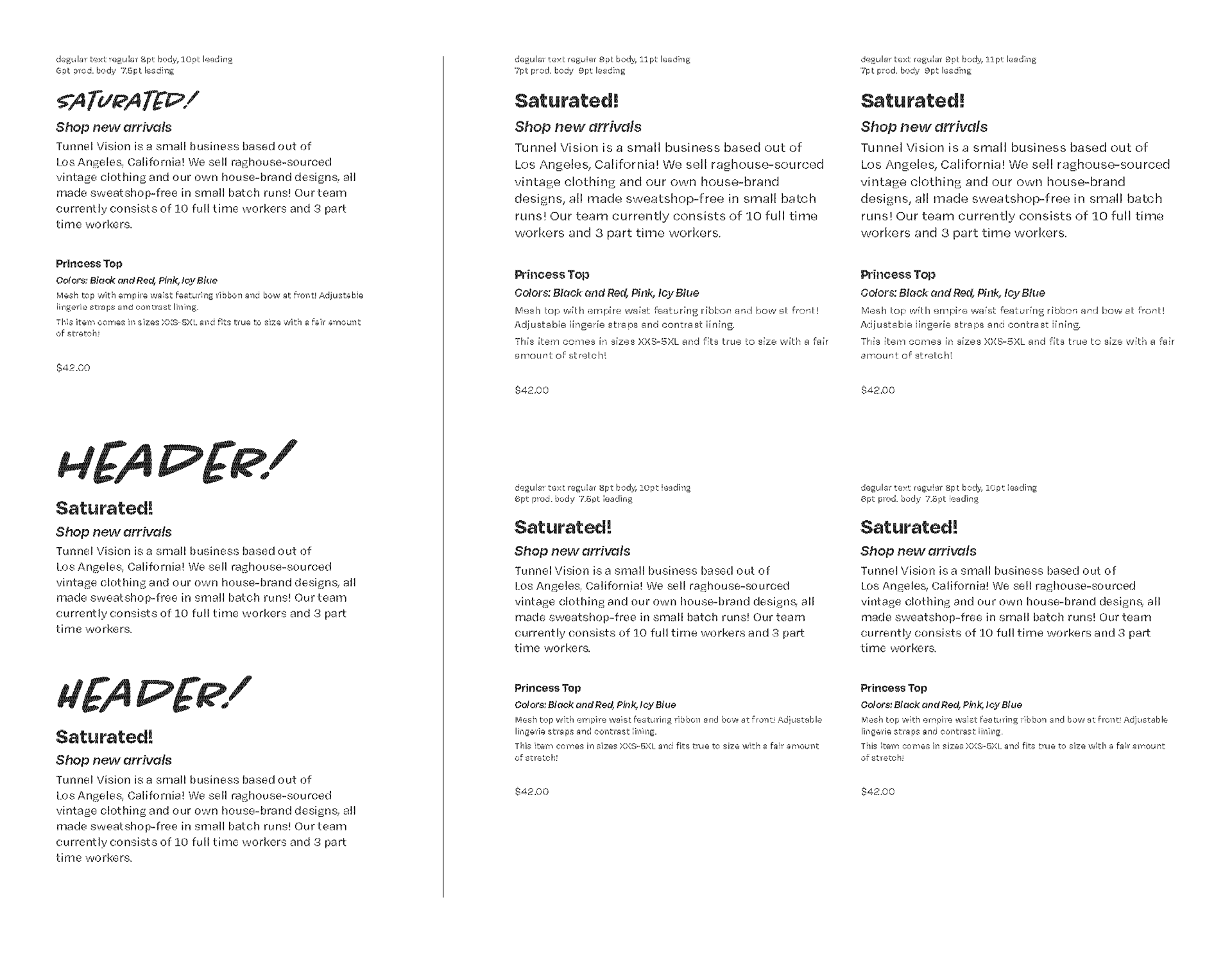
My final type system includes Chantal SemiBold Italic and Degular Text. The two complement each other well, and also mesh well with Tunnel Vision's existing typography. I used my final type selections to develop my grid- a 5-column grid with a baseline. This would eventually be further subdivided into a 10-column grid later in the project to allow for greater flexibility and more visually complex layout opportunities.
PRINT BRAND IDENTITY
I also developed an official style guide for any Tunnel Vision print design. Most of my decisions were directly pulled from their website or social media, but I had to improvise on colors since the brand is really, really fast and loose with using color palettes in official brand material. My dominant color became the striking lime green that makes up the Tunnel Vision logo, and a brighter sour lemon color that I created to complement.
COVERS
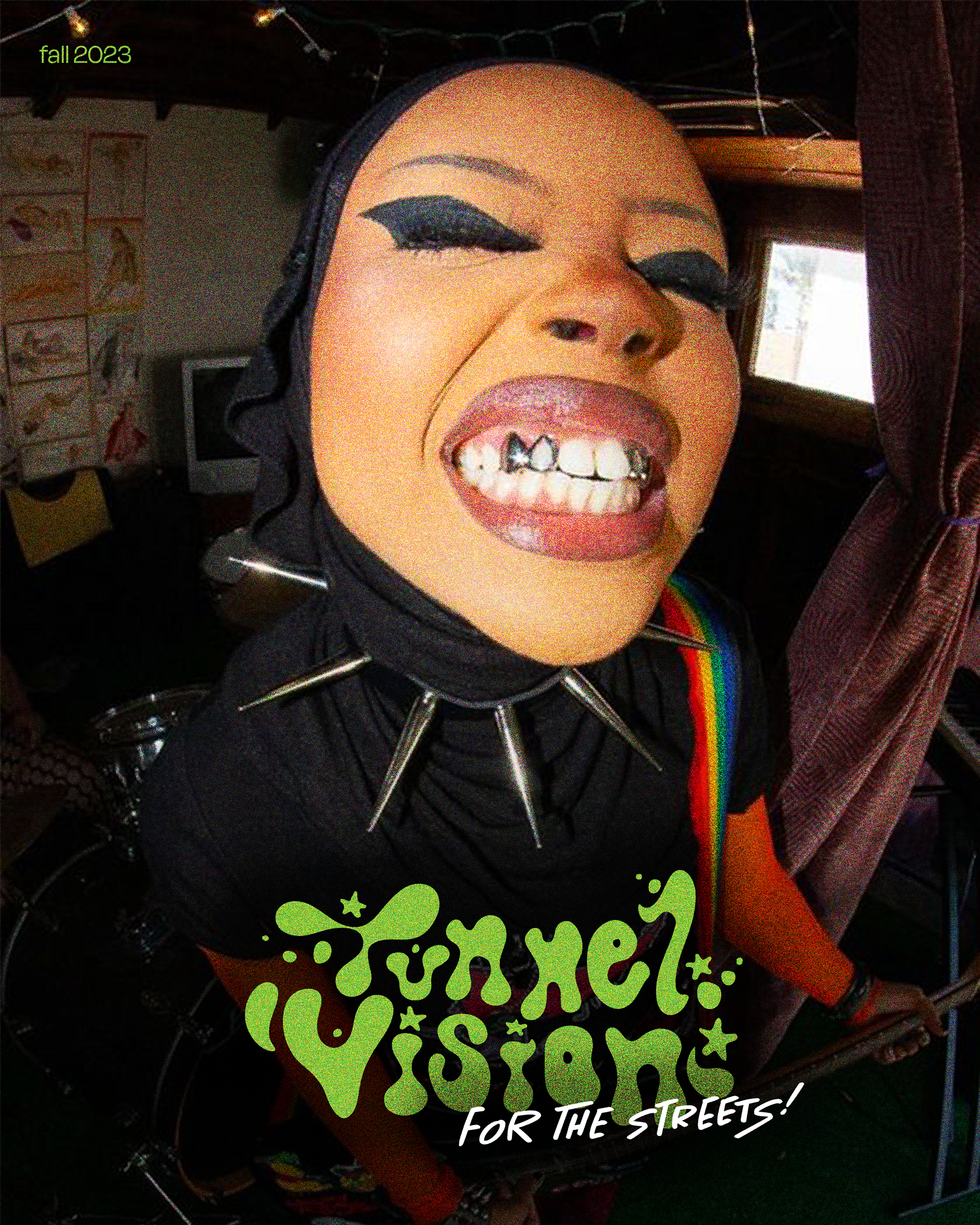
An attention grabbing, iconic cover is an essential of a good catalog design. After all, that's guaranteed to be the consumer's first interaction with your product when they get it in the mail. There's a good percentage of people that will throw mail-ads out without even looking inside if their attention isn't piqued by the cover design.
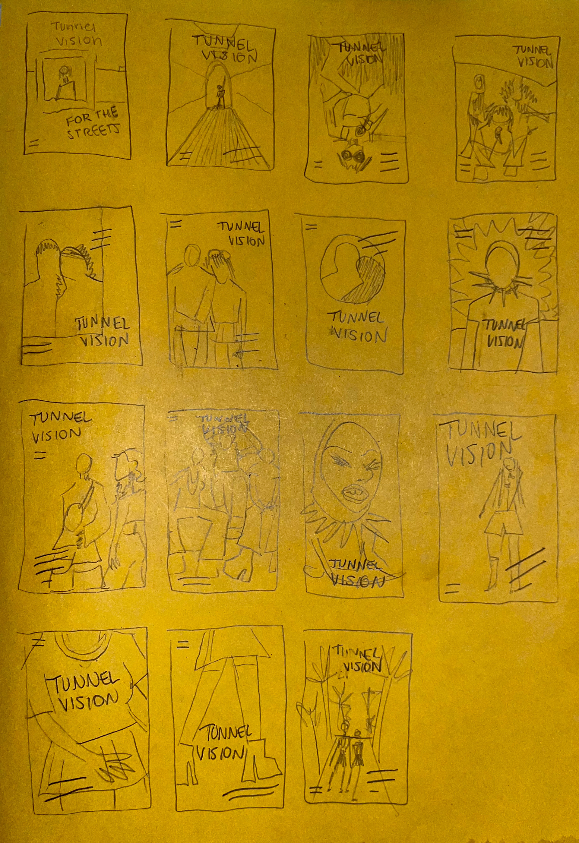
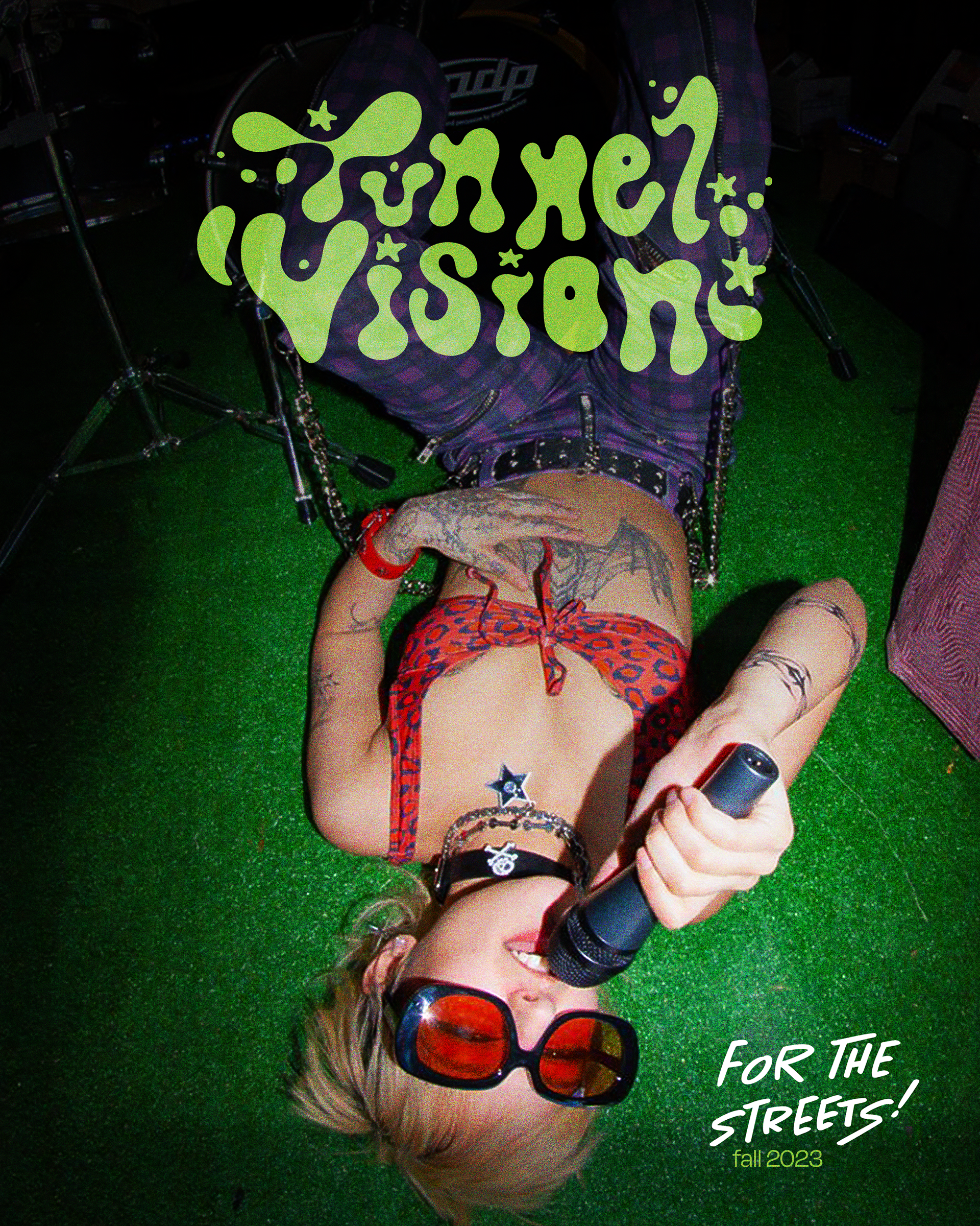
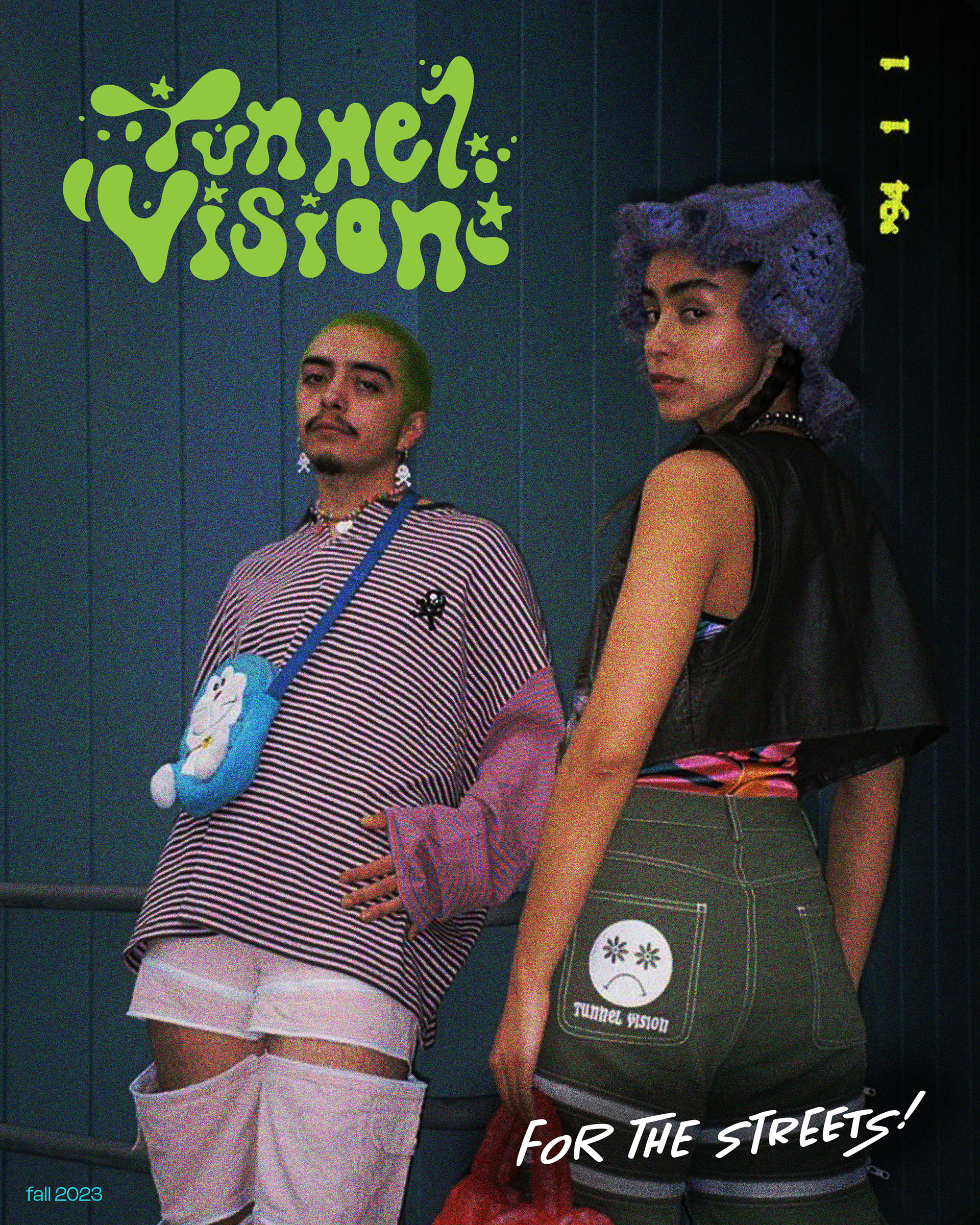
Tunnel Vision has a photoshoot inspired by garage bands that they've uploaded to their Pinterest. It's my personal favorite of all of their photoshoots. I really wanted to use a photo from their band photoshoot as the cover, as I planned on heavily incorporating other photos from that shoot throughout the catalog. For the sake of well-rounded design, I considered other options as well, going on to develop three draft covers.
Tunnel Vision has a photoshoot inspired by garage bands that they've uploaded to their Pinterest. It's my personal favorite of all of their photoshoots. I really wanted to use a photo from their band photoshoot as the cover, as I planned on heavily incorporating other photos from that shoot throughout the catalog. For the sake of well-rounded design, I considered other options as well, going on to develop three draft covers.
Peer feedback was pretty mixed, but as my cover photo spoiled for you, I ended up continuing with my upside-down rocker-girl.
LIFESTYLE & EDUCATIONAL SPREADS
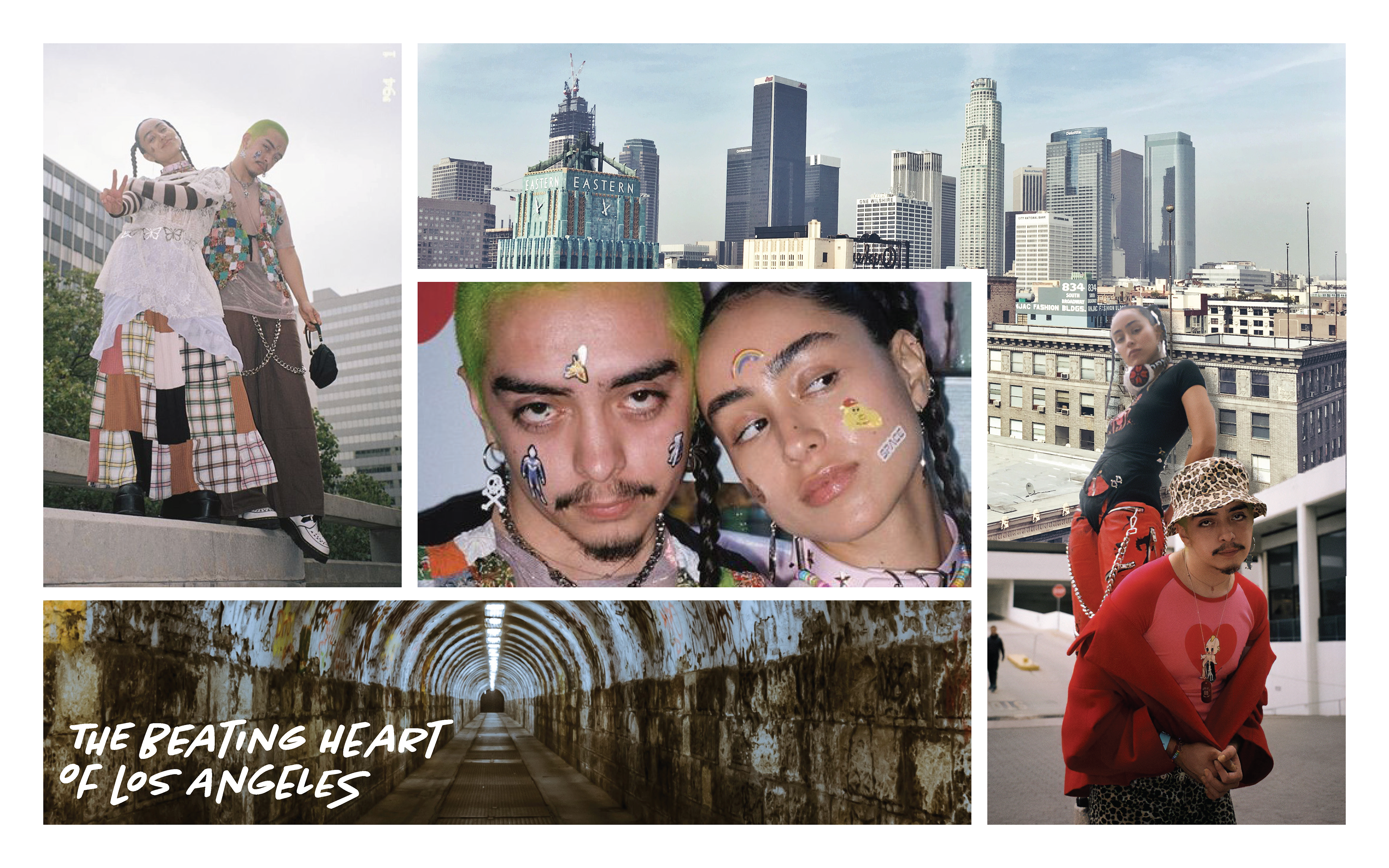
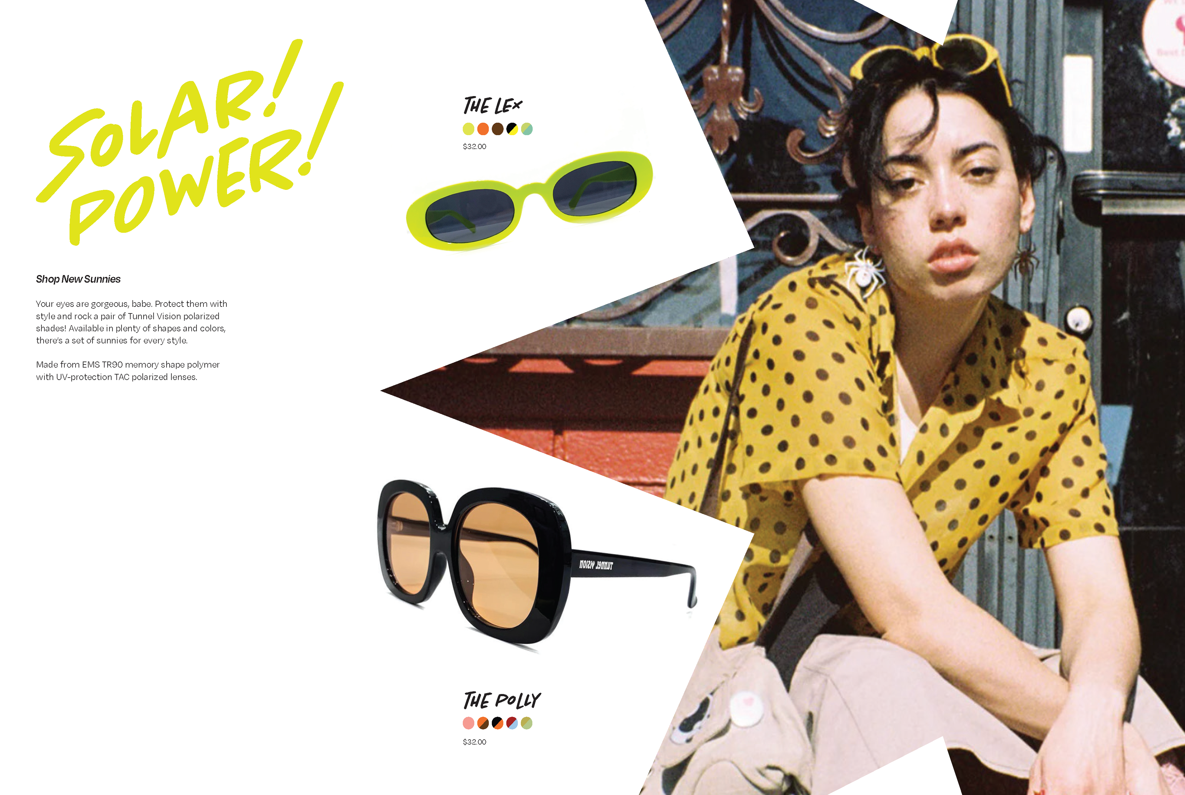
One of our assignment guidelines was to include lifestyle spreads and an 'educational section' within our catalog. Developing lifestyle designs- catalog designs that feature products in use, allowing customers to visualize themselves with the products- was relatively easy considering how lucky I had been with brand and product photography. If you ever want to see a bunch of really interesting streets-of-LA photoshoots, both promotional and aspirational, look no further than the official Tunnel Vision Pinterest board.

For my educational section, I had known very early on I wanted to highlight Tunnel Vision's buy-back program. Long process short, you can send your gently used or well-loved Tunnel Vision clothing, and Tunnel Vision will resell the item on its website and give you store credit for your clothes. Pretty appealing program. Tunnel Vision doesn't do a great job at highlighting this program on their website or social medias (I didn't know it existed until this project and I've been a fan for years) so I decided if I were in charge of designing their print catalog, it would be a great opportunity to highlight.
For added context, here's a list of our project guidelines as to what we needed to include within our catalog pages:
»12 pages minimum
» At least 15 products
» At least 1 lifestyle spread
» At least 1 grid of products spread
» Product Details (features, descriptions, dimensions, price, weight, color)
» About the Company
» Customer Testimonial(s)
» Educational Section (How to Use/Clean/Store _____Product)
» Return/Warranty Section
» Ordering Information
» Terms & Conditions
I’m very happy with my finished catalog design for Tunnel Vision. I think that I stayed true to the brand standards while also defining a unique print style for the brand and utilized some fun collaging techniques without completely over-crowding spreads. Tunnel Vision has lots of engaging photography and a playful, evocative existing brand identity, which made working within their house style a treat.
Thanks for reading,
Grace Eaton
