SUGAR RUSH ENERGY DRINK
LOGO AND PACKAGING, FALL 2022
Our first major project in my Concept & Making course was a two-part project- in the first half, we would create an original food or drink brand, building out a logo system, and the second half focused on the packaging of three different flavors of one of the products.
Sugar Rush Energy is a unique product that combines candy and energy drink in one 16 oz. can. Sugar Rush includes an aluminum compartment at the top of the can that houses pieces of a specific candy (this candy, like the flavor of the drink, changes with every variety offered). The idea is that the drink will filter through the candy, enhancing the flavor and providing a unique energy experience that will travel well through word of mouth.
Our final deliverables were a customized brand book with full logo system and mock-ups, packaging flats and mock-ups and the entire process detailed in a presentation before our peer group.
PART 1: LOGO DESIGN
PROCESS
RESEARCH
The first step of any project in Concept & Making was research, and lots of it. We were required to complete a mindmap, client persona(s), mood boards focused on specific parts of the project (the general branding one came first, the photography mood board later in the project), and a competitor brand matrix.
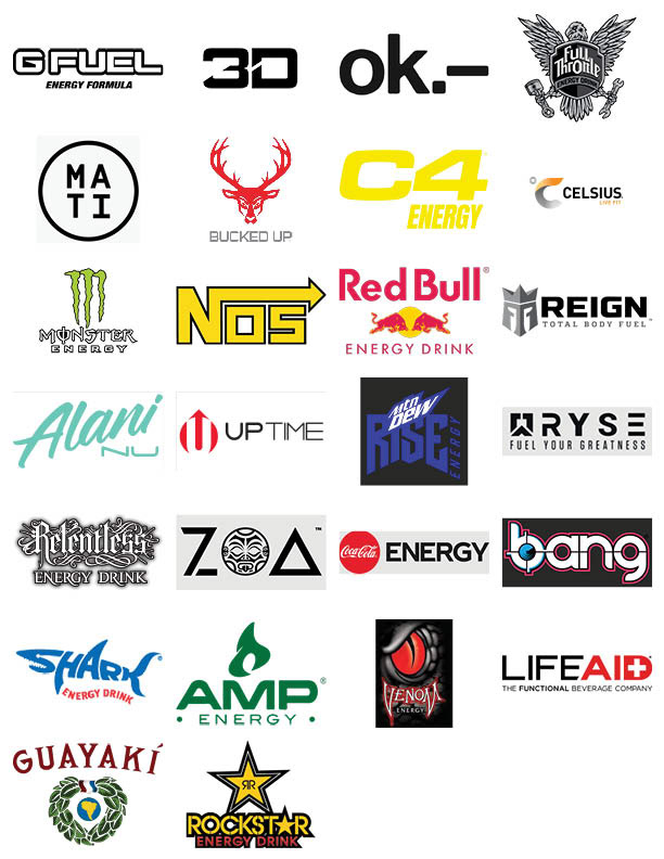
While completing the brand matrix (far right), a process where I sourced as many energy drink logos as I could find on the open internet, it confirmed the hyper-masculine identity of most popular energy drinks. Many of the popular energy drinks in my area- Monster, Full Throttle, Relentless, Venom, Rockstar, and even Reign- drew inspiration from a more Gothic place than some of the others. Aside from Alani Nu, which was a fairly new brand in Fall 2022, and some of the Monster variations, there was a noticeable absence of bright colors and illustration work on energy drink packaging, most brands going for darker, more simplistic branding.

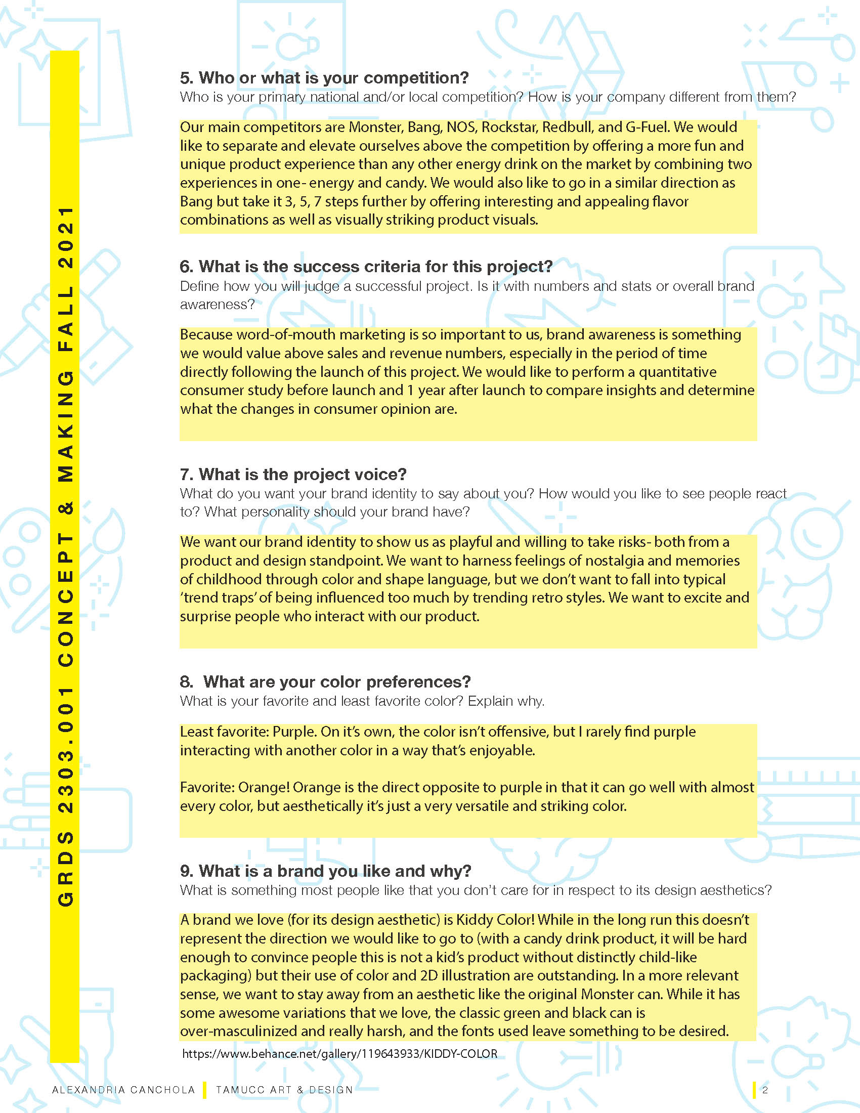
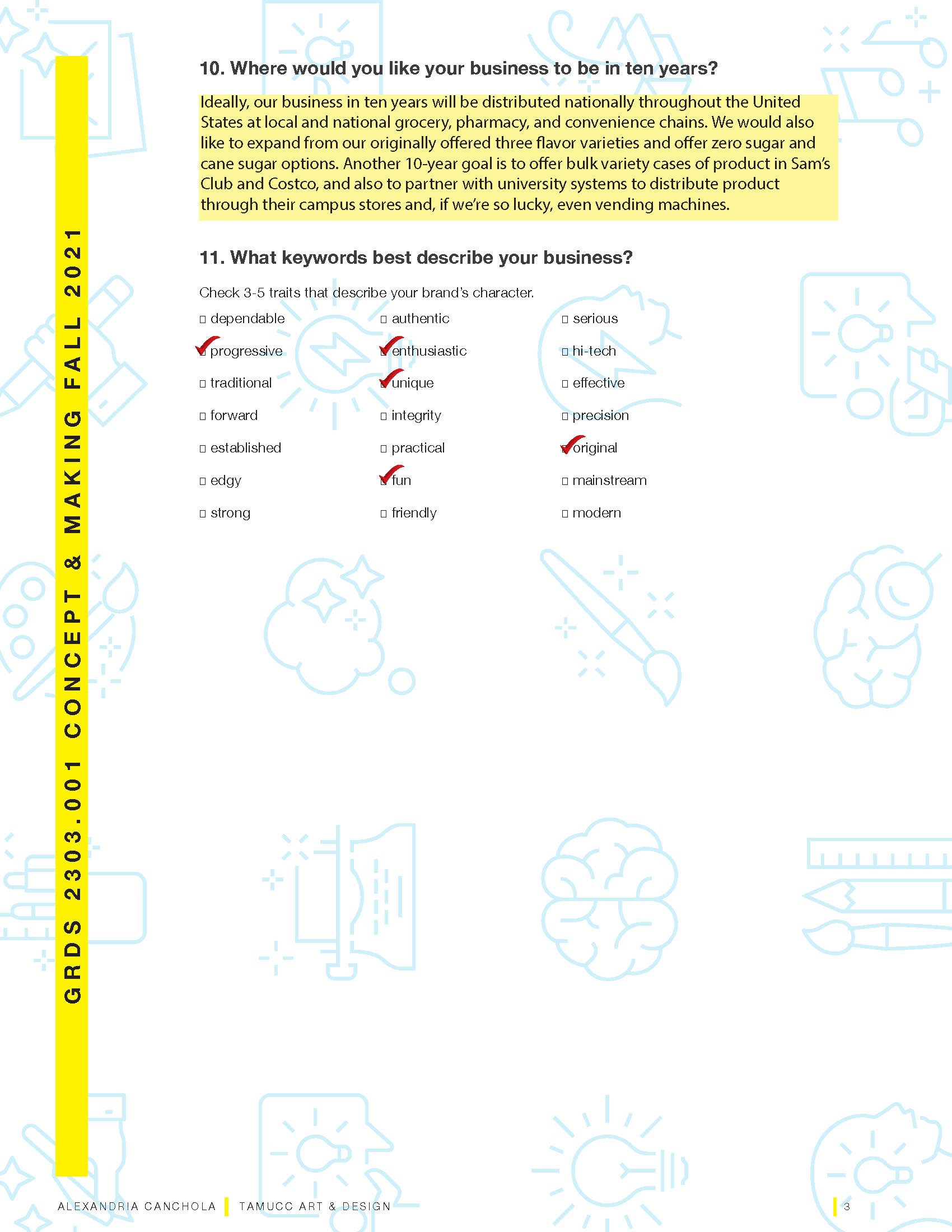
I also completed a Creative Brief from the perspective of the brand as a future client, a process that allowed me to experiment with the 'voice' of the brand and to figure out what exactly Sugar Rush would want out of a branding project.
PROCESS
LOGO DEVELOPMENT


The thumbnailing process for this logo development was grueling, as it was the first complex logo I had designed in my time at school. Motifs I explored included drag racing (not RuPaul's), vintage NASCAR aesthetics, and different ways to represent movement. I also, naturally, wanted to include a nod to some type of candy. I was careful to stay away from anything that might resemble Sugar Rush Speedway, the fictional video game from Disney's Wreck It Ralph, as I had already grown wary of being subconsciously influenced by the movie when creating my fictional brand.
These were the three concepts I chose to expand on after receiving peer feedback on my thumbnails. The multi-pointed stars are representative of Japanese sugar star candy, which is why the motif is seen multiple times throughout concepts. Even though I had chosen to move forward with these three, I wasn't thrilled with any of them. I liked the shooting star of the third concept, but was hesitant to move forward with script type (partially due to my professor's bias against script logos, partially due to scaling issues). I really liked the negative space SR, within the star on the second concept, but it didn't have enough movement. I liked the type on the first concept, but the mark was uninspired.
It was at this point that I did what any good designer would do- I made a mutant baby.
FINAL LOGO SOLUTIONS
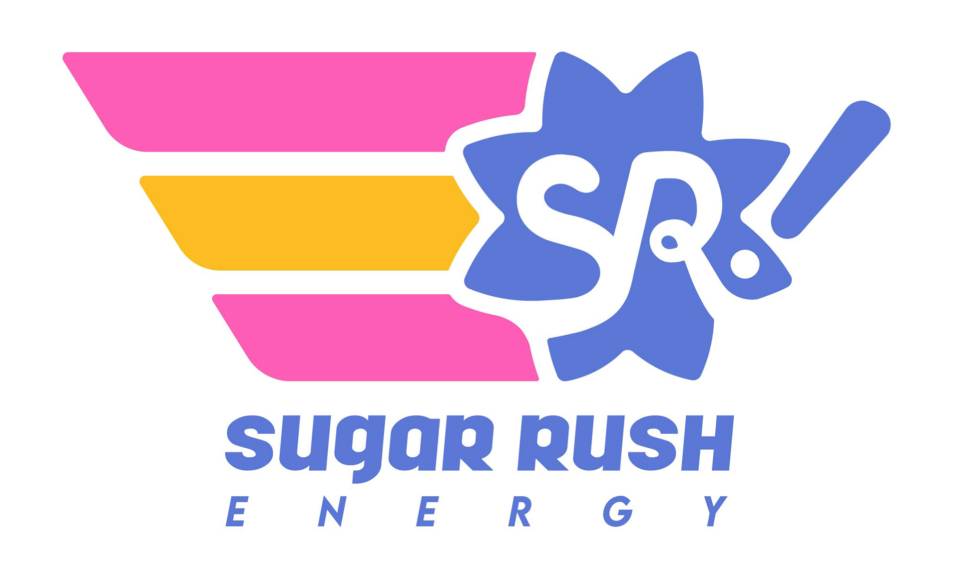
Here you can see my final three-color and black and white logo solutions. I'm quite happy with the way these turned out, I think my vision from the beginning of my ideation process is still visible in the final, which happens less than I would like it to. The angled shooting star trail is sleek and dynamic, and I'm glad I was able to keep a Japanese candy star in the final execution.

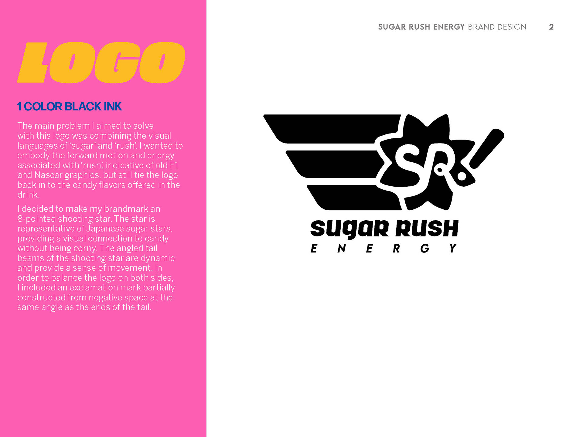


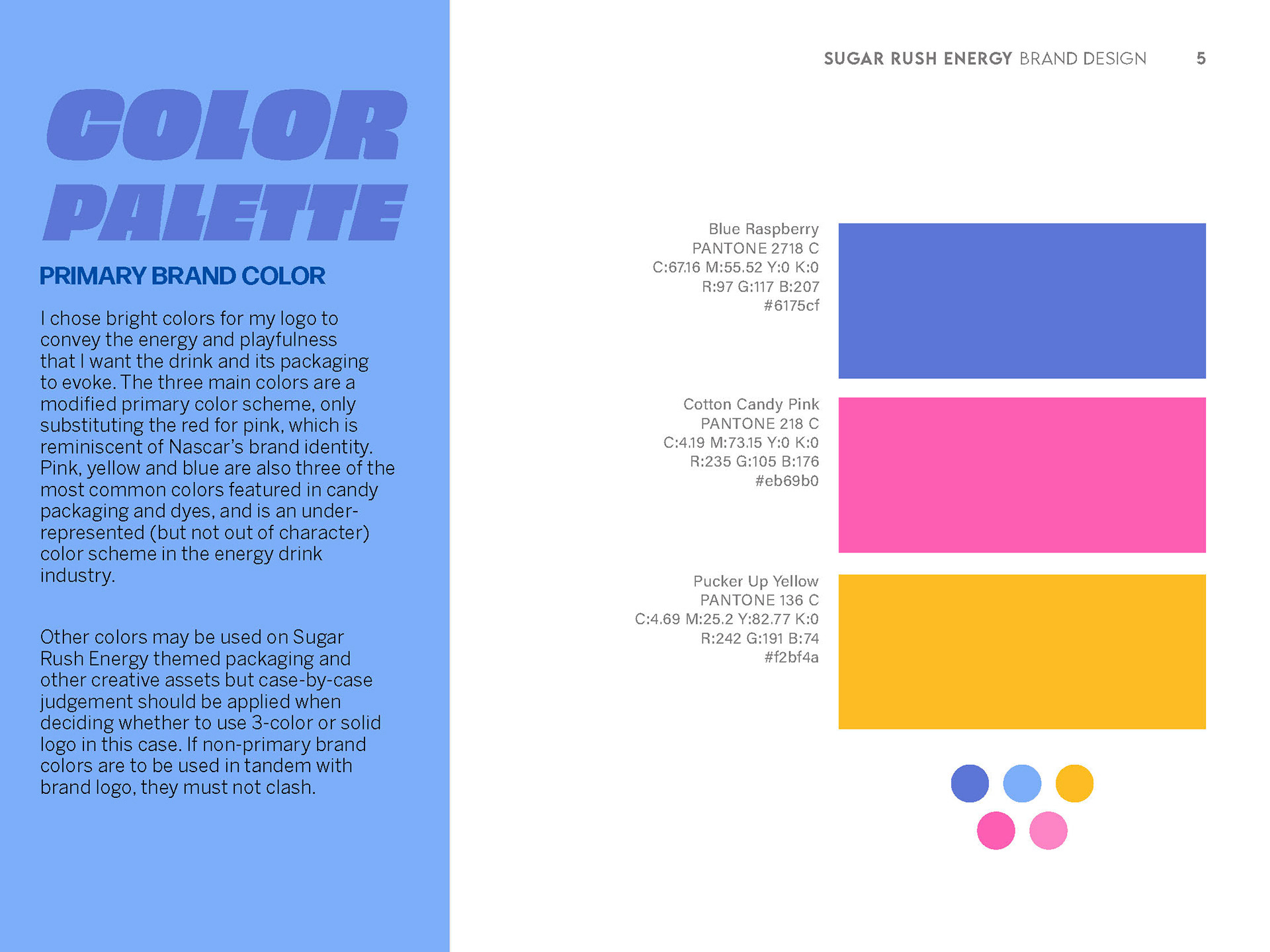
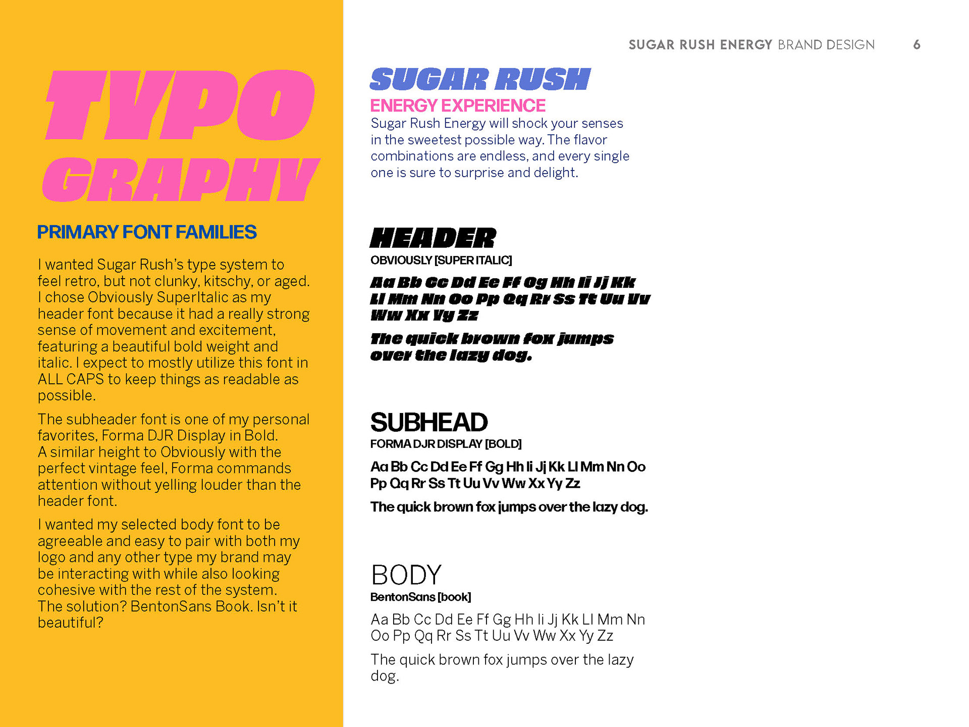
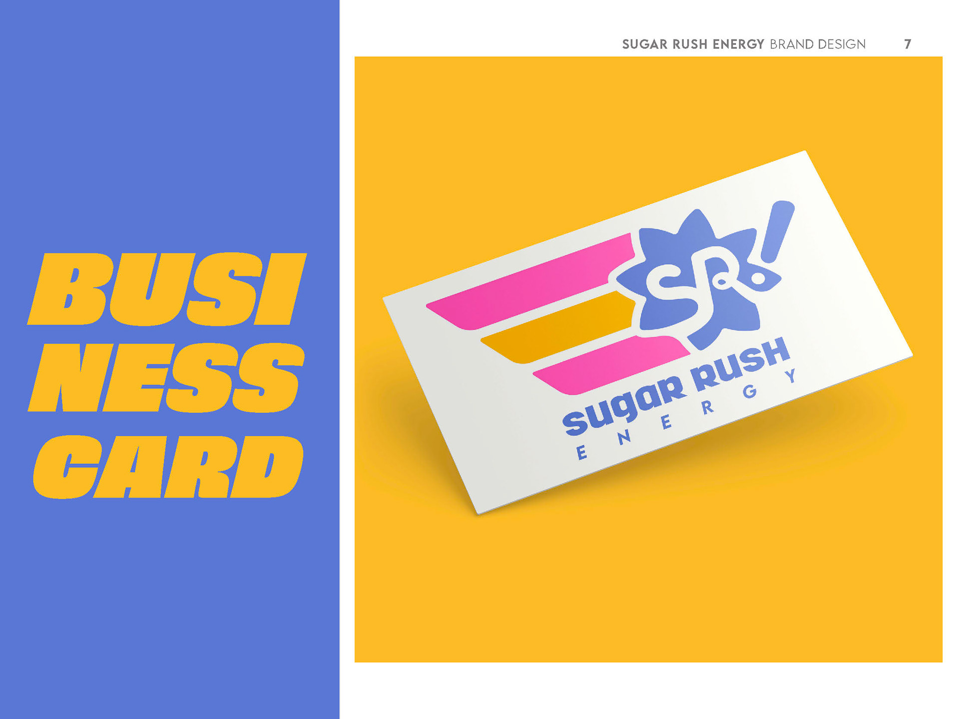
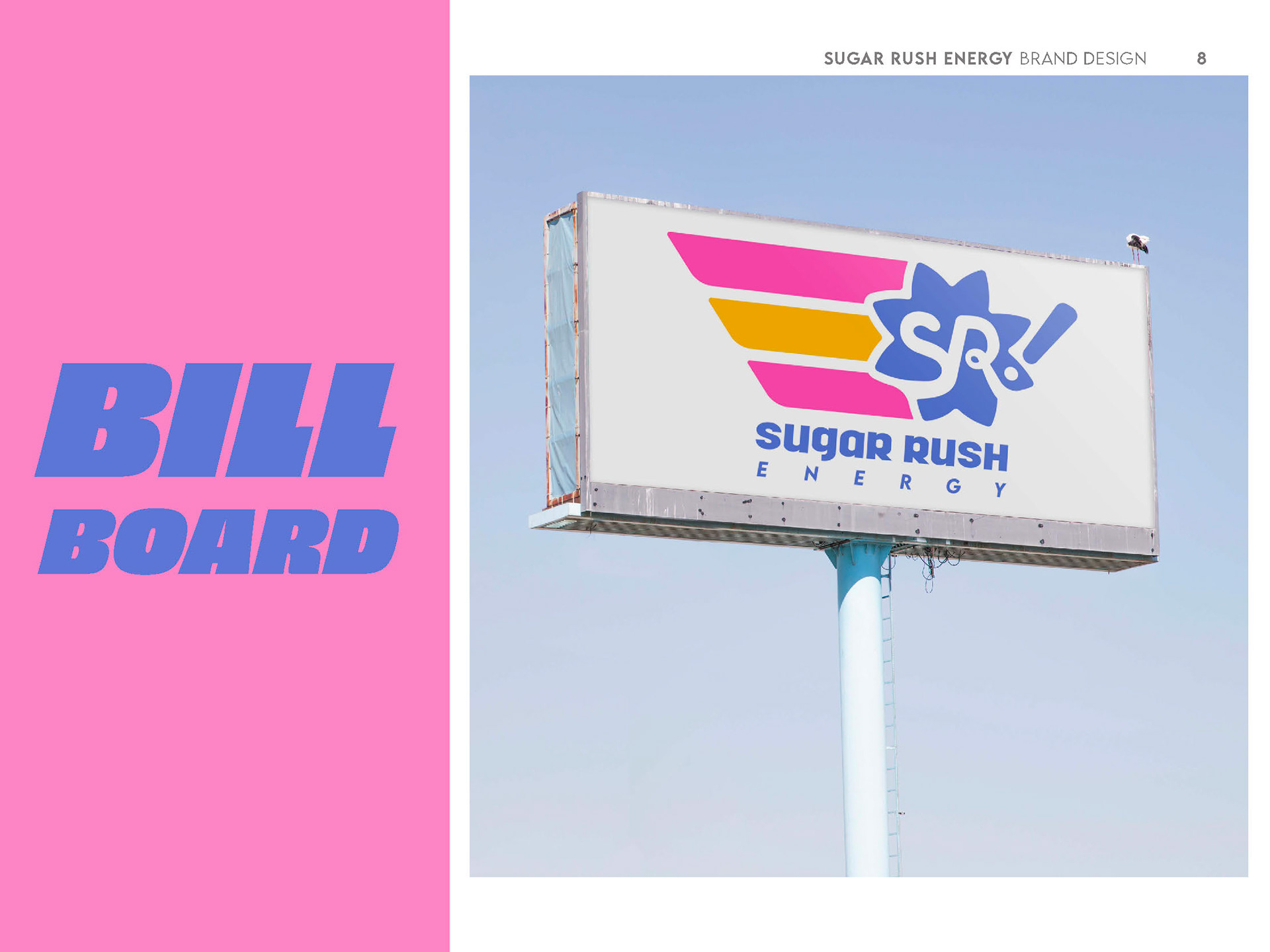


This brand book was presented as a slideshow presentation in front of a panel of professional graphic designers in the Corpus Christi area! It details the logo solutions, color palette, brand typography, appropriate uses, and a series of mock-ups that display the logo in different contexts.
PART 2: PACKAGE DESIGN
PROCESS
RESEARCH
The main expected target audiences of Sugar Rush Energy are teenagers over the age of 13 and university students (and university-aged adults). The main energy drink competitor big with teenagers and college kids is Bang, mostly made popular through its colorful and high contrast packaging paired with its outrageous flavors. Sugar Rush Energy aims to target teenagers and young adults who seek a social aspect to product consumption, allowing the product to travel through word of mouth.
Teenagers love to go shopping with their friends. Nowadays, this shopping is done less at places like the mall and more at big grocery stores like Walmart, Randall’s and HEB. Teenagers will wander the aisles with their friends, finding weird and interesting products to talk and make jokes with their friends about. Sugar Rush Energy is the perfect candidate for this social ritual. Not only will the product’s packaging be colorful and eye catching, but there is also a shock value generated with a unique product like a candy/energy drink amalgamation.
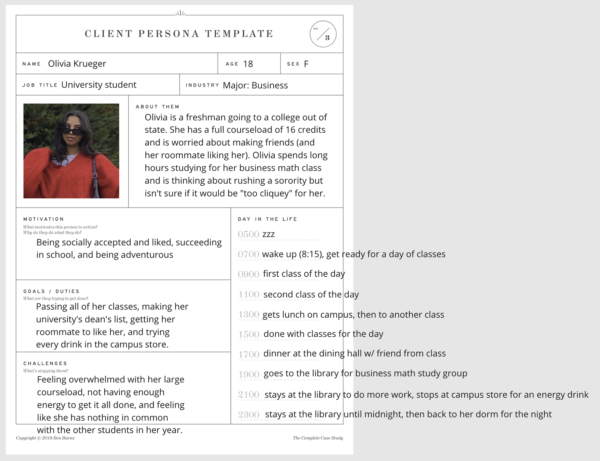
College students are alike to teenagers in that Sugar Rush Energy can be brought into a social setting, even if it’s as simple as “Hey, have you seen/tried this weird new energy drink at the campus store?”. Additionally, university students are among the biggest consumers of energy drinks, sitting right in the middle of the “17 to 34” age bracket that is commonly cited in industry research. The reason? University students spend long hours on coursework, often late into the night, and even the placebo effect of energy drinks having the power to get them through the night is enough to send them to the store or a vending machine before hitting the library for the night.
Sources
Here's Olivia again, joined by a new persona that I created during the packaging ideation phase.
PROCESS
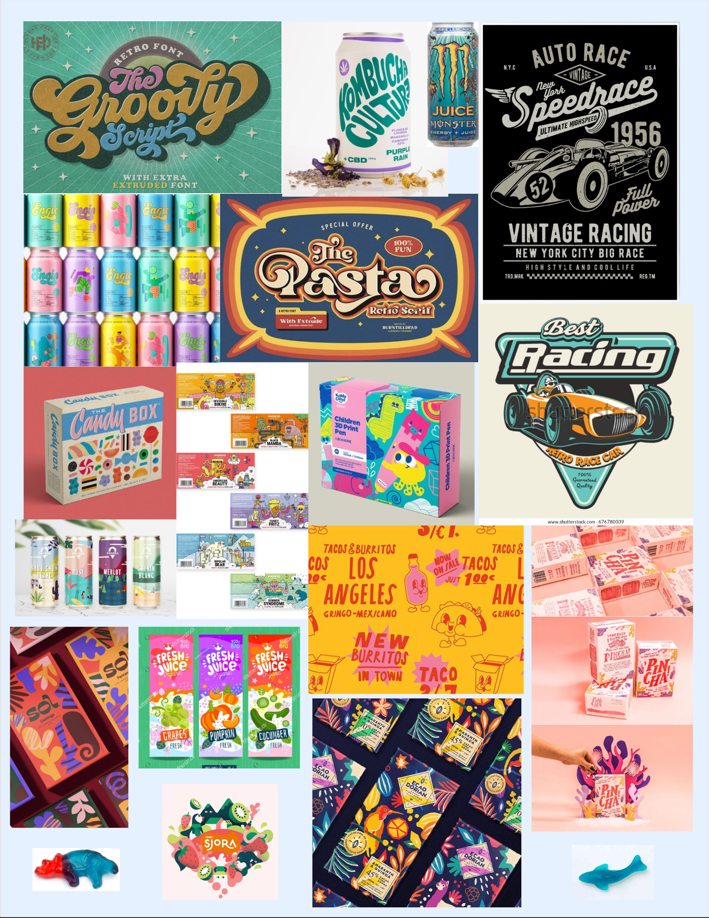
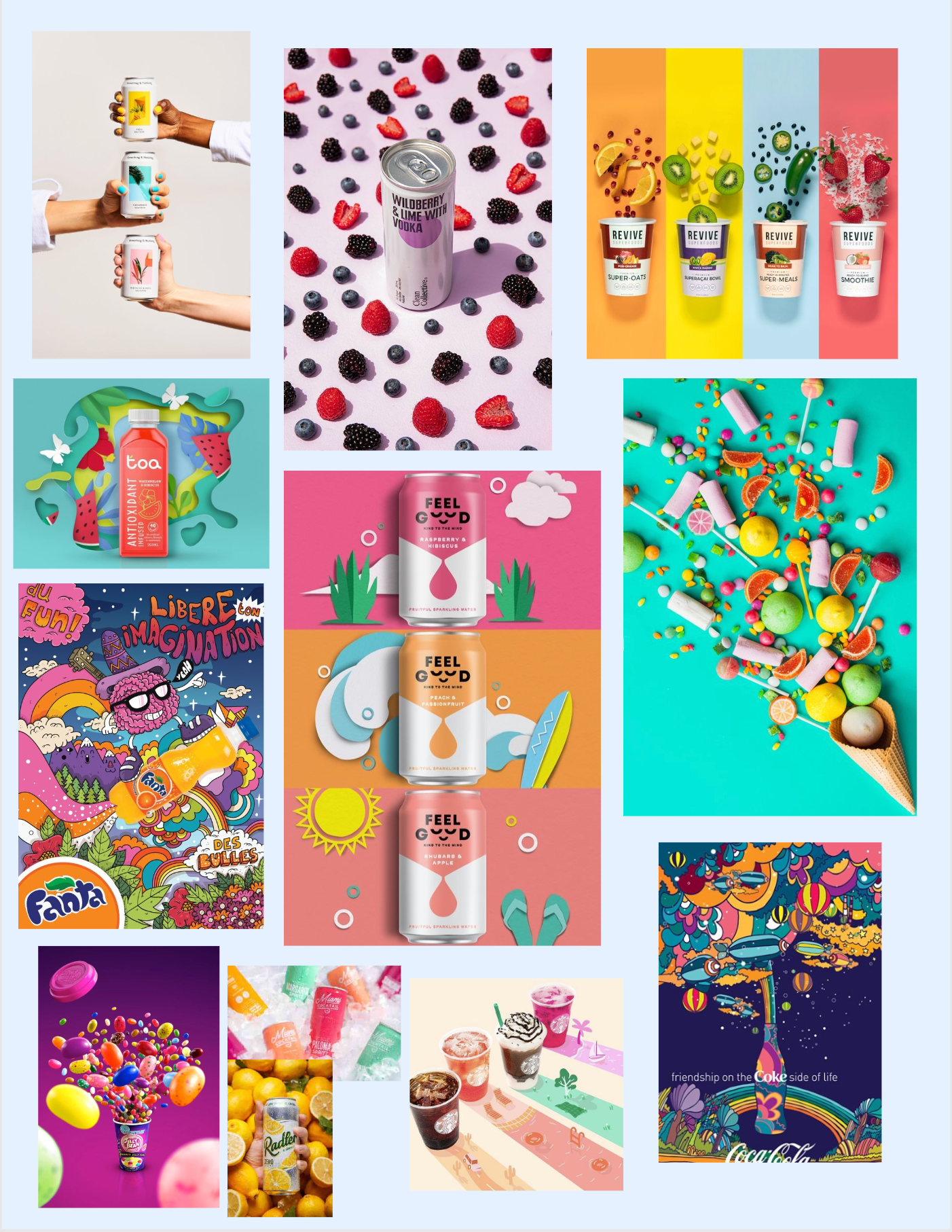
A visual motif that I explored a lot were the two 'aspects' of the flavor- the drink flavor and the candy- being visually forced together or mixed. I wanted the packaging to be as dynamic and exciting as the logo, and the one direction I was absolutely certain on was including hand-drawn illustrations on all of the flavors. As seen above, I was inspired by drinks like the Monster Juice line, Alani Nu, and Calypso, but I wanted to put an original, unique twist on the illustrative style that these brands use.
Here we can see the three concepts I chose to refine from my thumbnails, this time fully fleshed out into colored digital drafts. I used the same type treatment for all three, certain that I had it in a place that I liked it, so these drafts were mostly exploring different visual styles. I was in love with the bounding box on Melon-Ade's draft, but unfortunately the shape was lost once it was wrapped around a can, resembling more of a cat head than a starburst. Everyone in my critique's favorite was Sharknado, and as it was my current best option, that's the direction I took all three of my package designs in.
FINAL PACKAGING SOLUTIONS
`At long last it was time for the final executions of my labels to come to fruition. I decided on diagonal gradients across the face of the label in order to ground my fruit and candy illustrations in something that provided a clear emphasis on the concept of fusion. On a flat background, many of my illustrations seemed to be placed thoughtlessly, but mounted onto a striking and visually pleasing gradient, it became more clear that the candy and the fruits were coming together on a collision course that’s blocked only by the logo and flavor information. I kept all of the typographic color monochromatic and simple, hoping not to visually crowd the labels or make them hard to read. My illustrations were a happy medium between a few earlier concepts- shaded with just enough dimension to visually pop off of the label, but smaller and with less heavy line art than other drafts, providing a more clear hierarchy between the logo and illustrations. A consistent piece of feedback I received was on ensuring that the logos didn’t get lost, and I think I struck a manageable balance. As for the logo coloring, I decided to keep at least one (but median two) of the original logo’s colors in order to keep my strong brand identity present and maintain some consistency across an otherwise highly visually diverse product line.
The overall result? A fun and visually interesting product line that showcases the product contents in a striking and unique way. Sugar Rush Energy would demand attention on store shelves, and I would have a hard time not giving it to them upon seeing the product in my local supermarket or convenience store. The process of this project and the last have allowed me to explore concepting and ideation with an intensity that I never thought possible, and I’m happy with my final executions. Thank you for reading, and I hope others would pick this item off of a (hypothetical) shelf as well.
