RISOGRAPH TYPE ANIMATION
TYPOGRAPHY II | SPRING 2022
I had the honor of partnering with fellow student designer Katelynn Phelan (@katphelan.tamucc.ai) in order to create an analog risograph type animation for our Typography II final!
Our assignment was to choose a lesson from a series of 'Why Do We...?' lectures that we received in class, based on a keynote by Ellen Lupton, and to demonstrate the principle in question through type and simple shapes, showing our stance clearly. The practice we chose was why we use layout design in the industry and where the most common layout choices stem from!
Our final deliverable was a set of 192 risographed animation frames (assembled onto eight 11in x 17in sheets) scanned and assembled into a moving animation on After Effects.
PROCESS
THUMBNAILING & DEVELOPMENT
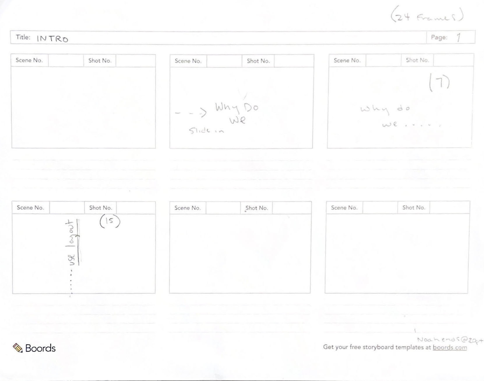
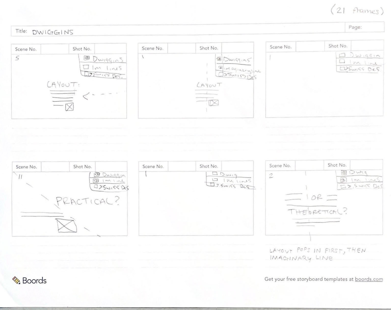

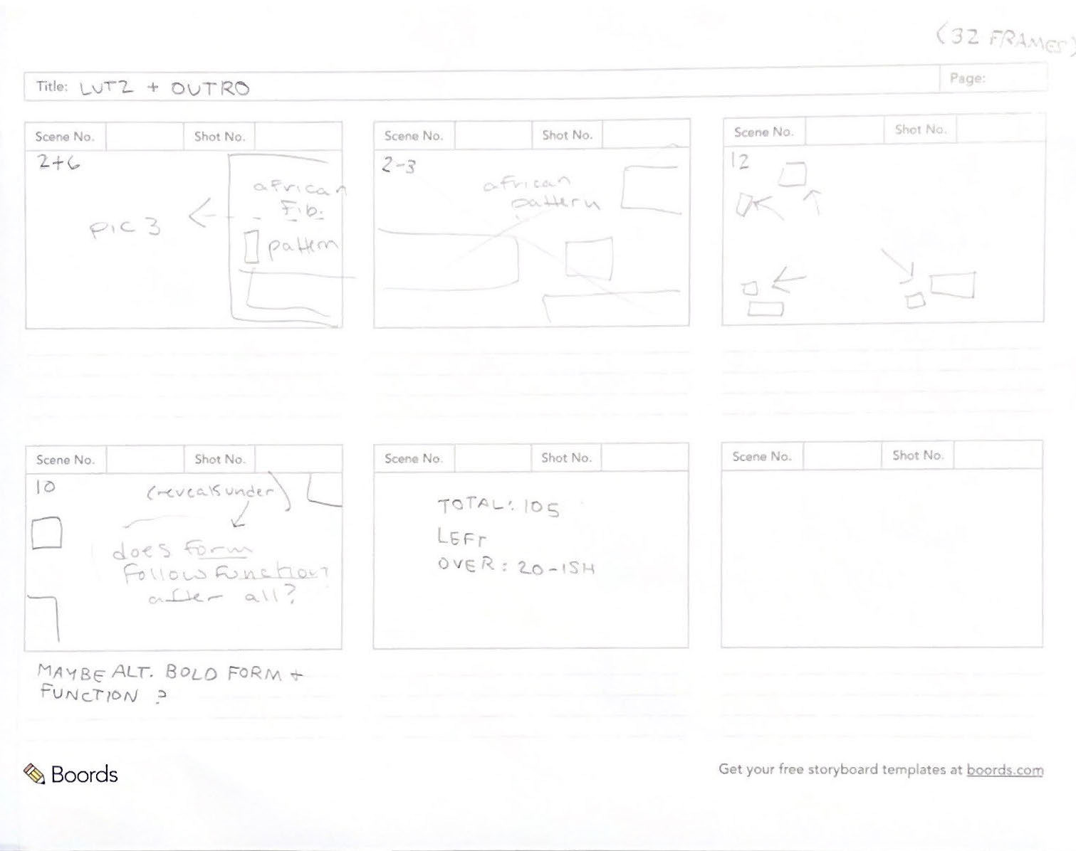
You'll have to view those scans in gallery mode, they're pretty light, but we used a keyframing process to figure out the key- ha- points of our animation. We chose to approach the structure as sort of a history lesson, and there were certain historical names and concepts that we wanted to make sure we included within our animation. Our key players are William Dwiggins and his imaginary lines, Max Bill, H. R. Lutz of swiss design fame.
You can see Kat and I's notes from our first concepting session above. We decided we wanted to mimic the layers panel in most Creative Cloud programs for multiple good reasons: we wanted a smart way to include layout guidelines without breaking the 4th wall, it was a less-clunky way to include labels to each section to try and minimize viewer confusion, and it was also just a fun nod to the programs.
Here is where we also decided to use turquoise and orange so that we could use the iconic Guides color from Adobe on our imaginary lines (orange is because we wanted to channel our inner mid-mod and the contrast was too good to pass up).
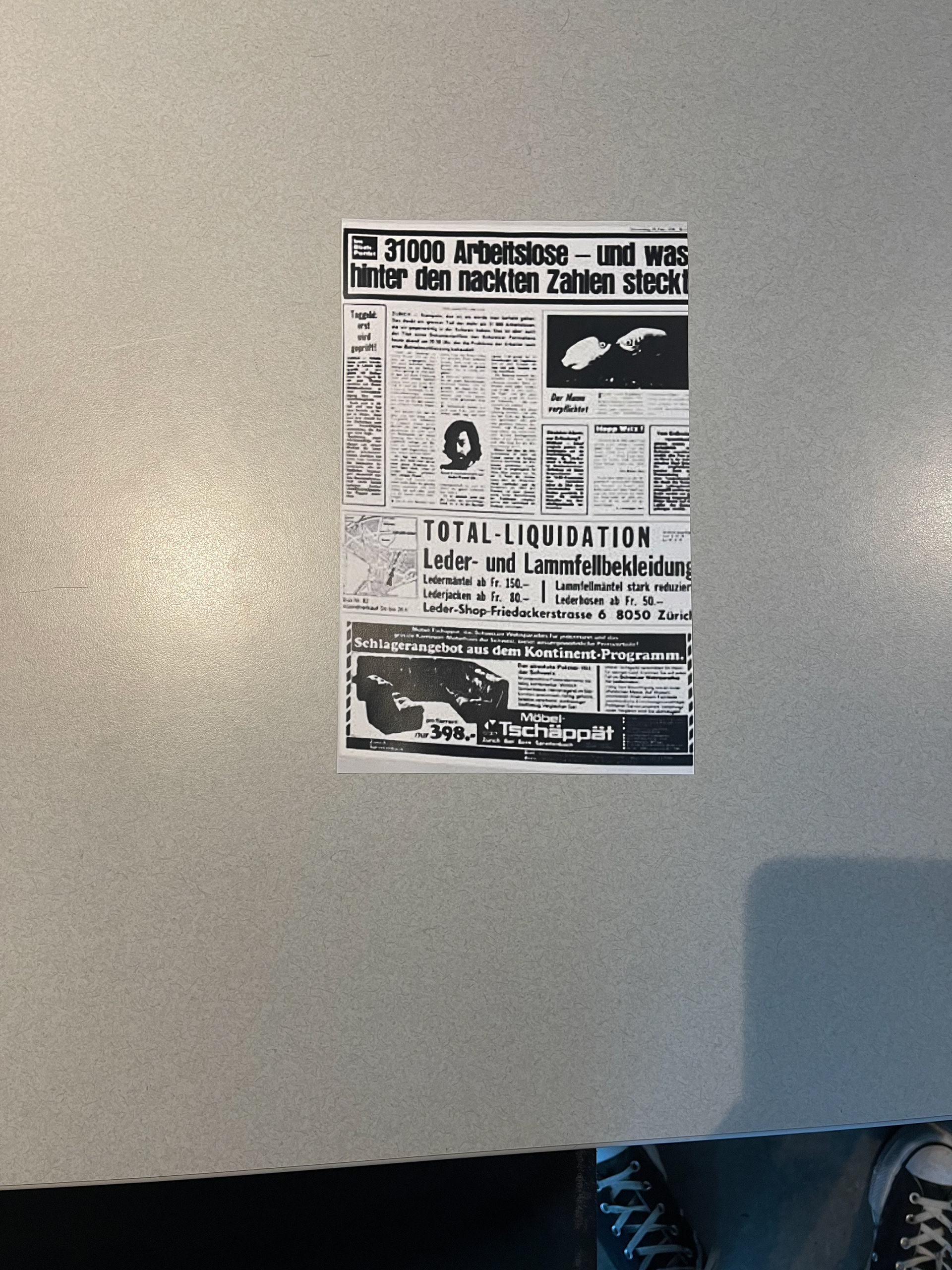

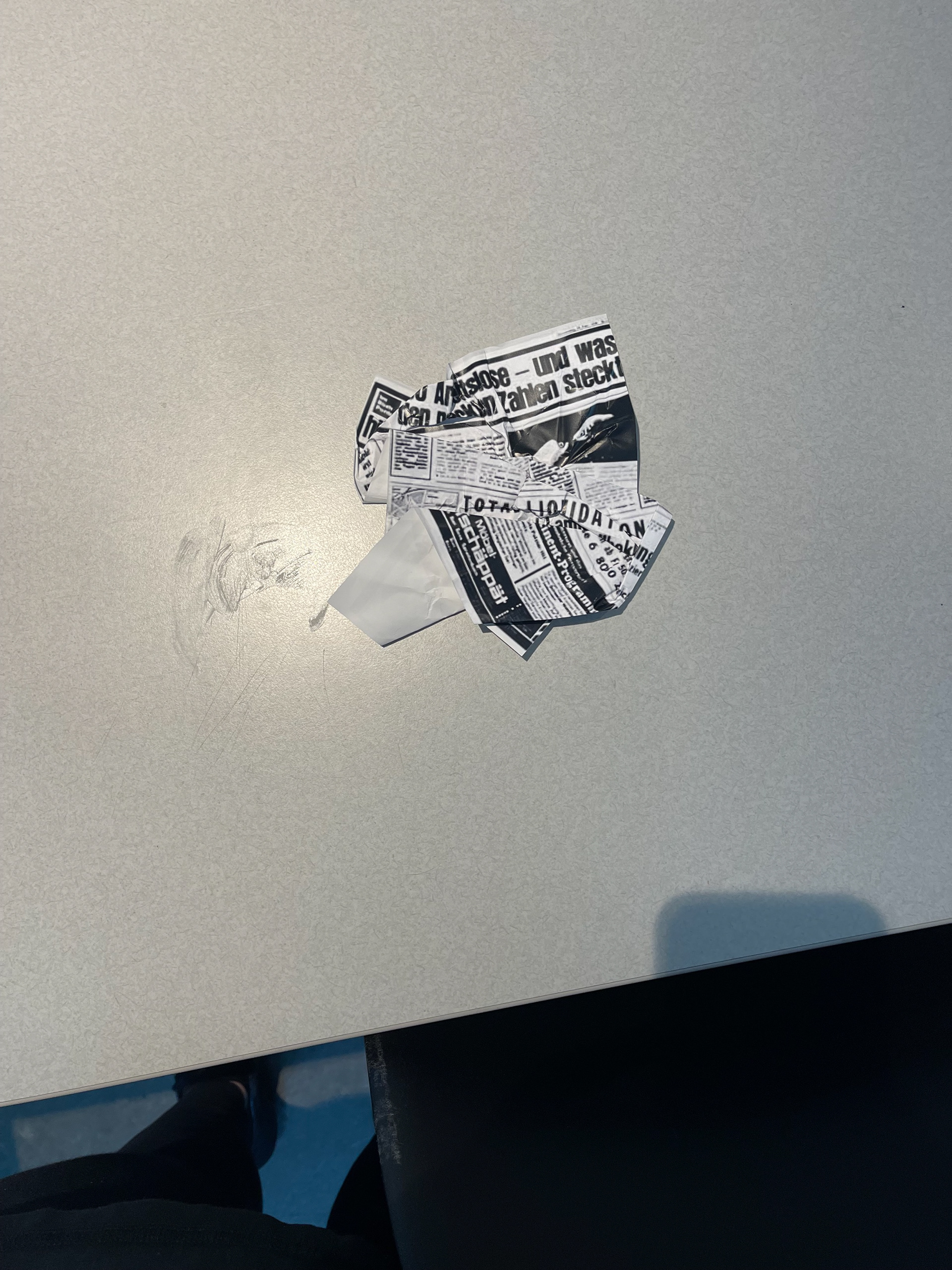
You'll have to imagine a comically loud SPLAT when looking at this series of images. While we were supposed to only use simple vector shapes and type for our animations, animating the unusual paper crumple layout by Lutz was just too alluring to pass up, and our rule-stretching was forgiven. We took scans of multiple stages of the crumpling and utilized them in our animation!
PROCESS
FRAME CREATION
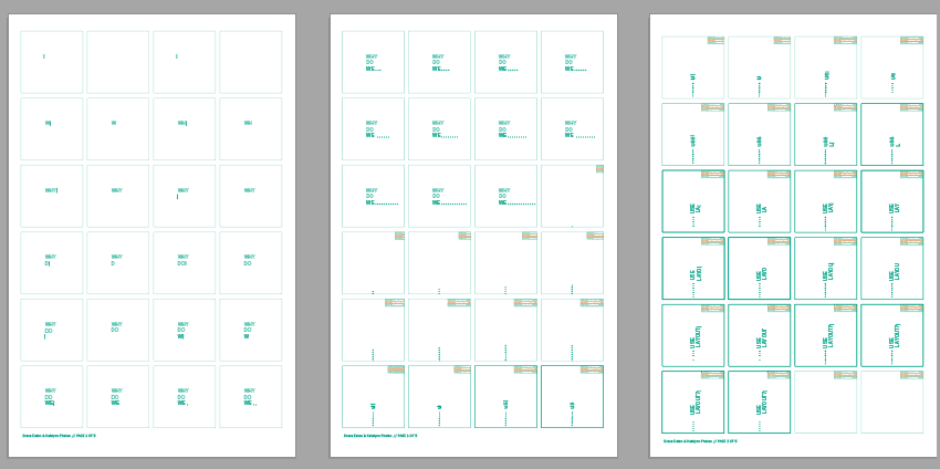
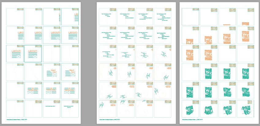
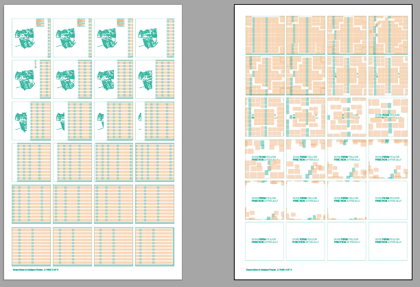
Sorry for the suuuper low-quality screenshots, but the nature of the risograph means that unfortunately our final PDF files are separated by color and therefore unintelligible. Instead of looking at these crunchy files, you can look at our final animation instead!
Visual concepts included in the animation are: imaginary lines, the fibonacci spiral, H.R. Lutz's unique crumpled paper layout, the golden ratio and a reference to an African textile pattern that included it!
It was a pleasure to work with Katelynn, we have pretty similar workflows (although she's notoriously much faster than I am) and once we did our initial conceptualizing all of the pieces fell into place.
