"ONE WORD" BAND POSTER
WILD CHILD- EXPECTATIONS
FALL 2022
This was a short project that I was very, very excited for. We were allowed to pick any band to create a concert/venue poster for, with just one twist: the poster must contain at least one word (band name or album) that influences the concept in a significant way.
Project 4 was a classic ‘gig poster’ with the name of either the name of our chosen band or one of their albums influencing the concept. I chose native Austin band Wild Child, a folk indie group that’s been producing music since 2010 (spoiler alert, I'm a total superfan, I've been to four of their shows and met two of the band members, during which I almost passed out). I chose to display their latest album, Expectations, released in 2018. As per project guidelines, my visual concept was pulled directly from the album name Expectations. I chose to focus on the bleaker outlook on expectations: missed and unmet. The band at the time was going through a tense period, likely due to the off-again-on-again nature of the two lead singers’ relationship. This is reflected in the album, which is moody and contemplative, leaning more heavily into the sounds of blues than in their previous works.
Our final deliverable was a set of 20 two-color Risographed 11in x 17in posters.
RESEARCH & DEVELOPMENT
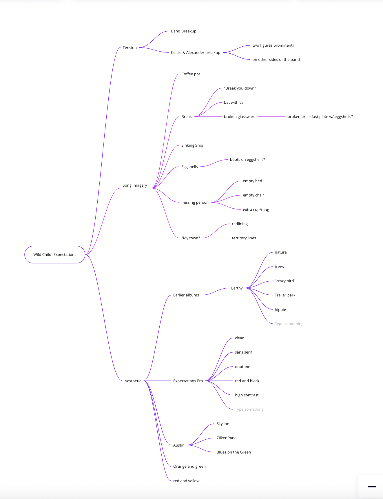
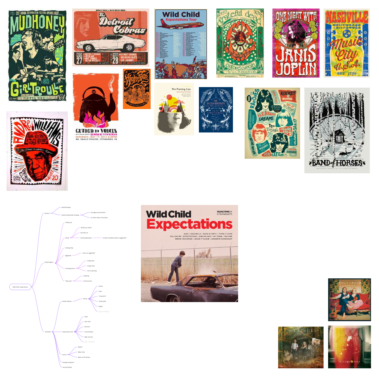
Venue posters are such a fun art form, I wanted to make sure to stay very true to the American Traditional aesthetics that are so common throughout the medium, which also happens to work very well with the Expectations Tour media created by Wild Child's team. I tried to explore both expected and unexpected (no pun intended) directions to take the visual metaphor, which can be seen both in my mind map and my thumbnailing.
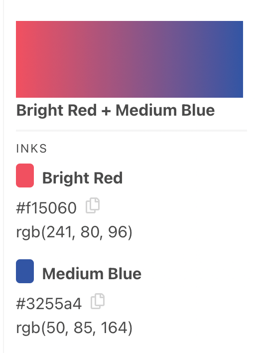
As we would be Risographing our posters, I made sure to keep colors in mind from the very beginning, and decided on a complementary red and blue color scheme. I chose these colors not only for the striking complementary color scheme they provide, but also because they match the colors used for the Expectations album press and advertising material. These colors were used in the official Expectations Tour announcement poster from 2018. They also remind me of Austin, the band’s native city and the source of much of their pride, as red and blue were the main colors used in the famous ‘Greetings from Austin’ postcard mural, the well-traveled ‘Austin 1002’ piece by Joel Anderson, and, of course, the colors of the Austin flag (not that anyone knows about that flag).
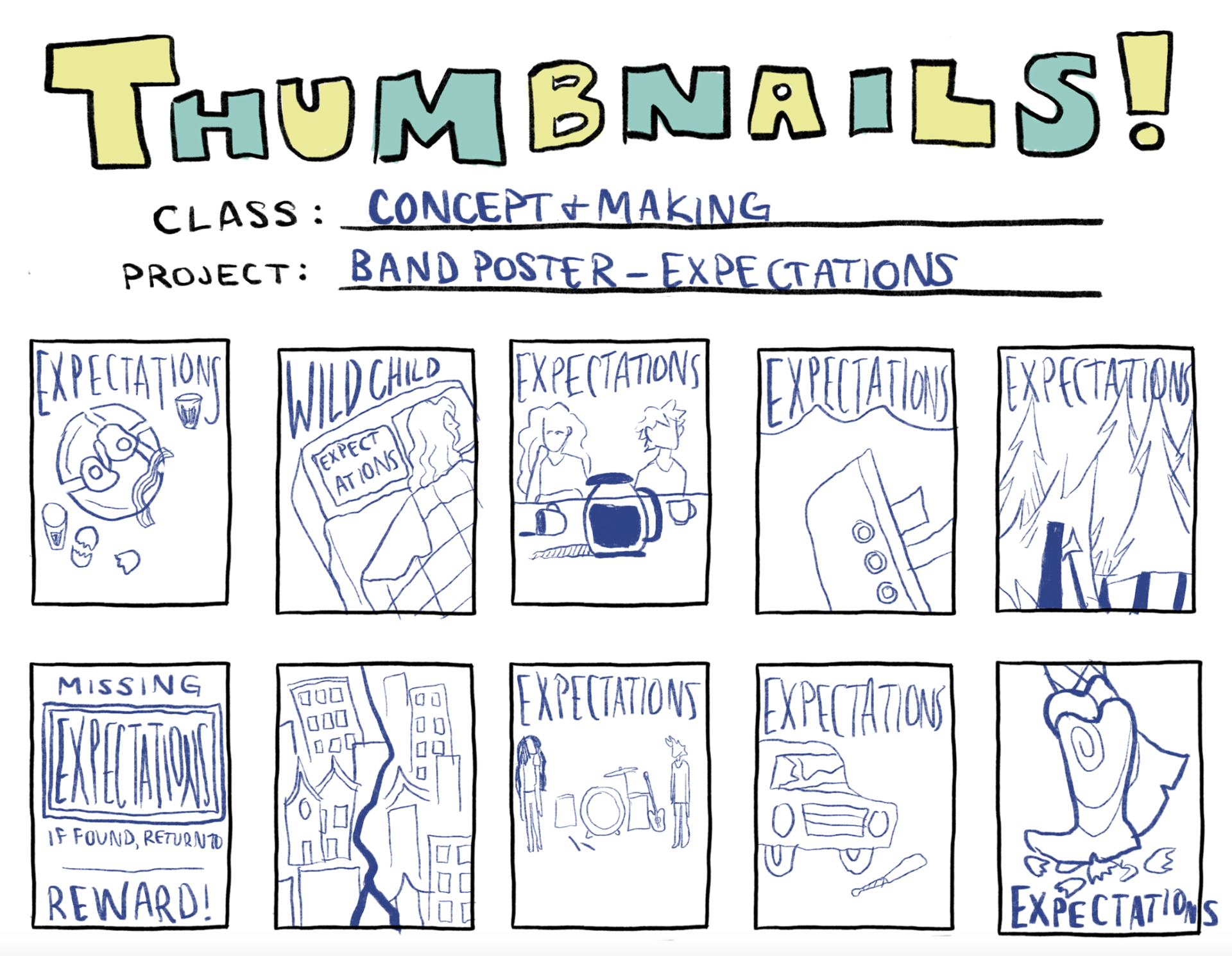
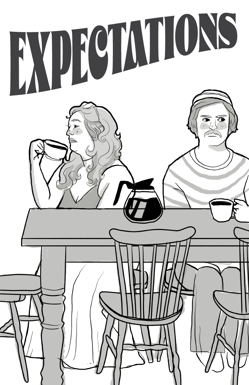
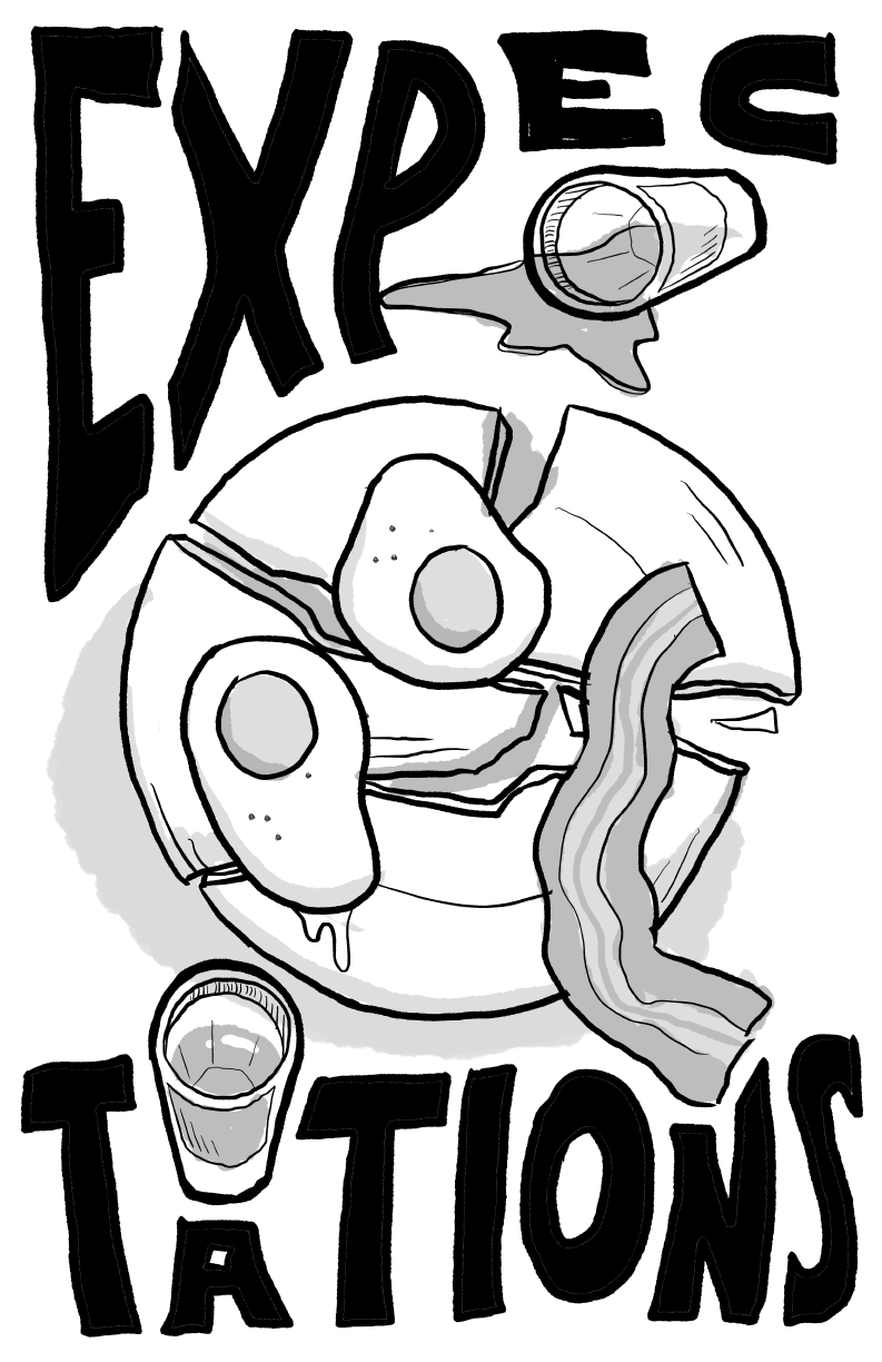
I worked with many concepts playing with unmet expectations in my thumbnails, showing a woman in an empty bed, missing band members from a full rock setup, a plate of breakfast smashed on the floor, and many others littered with references from songs within the album, such as the sinking ship and the pot of coffee.
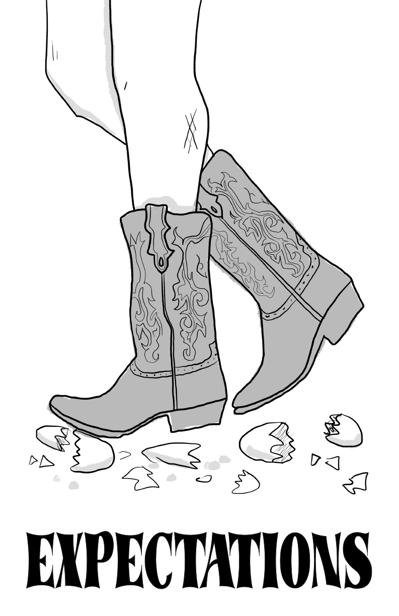
My strongest concept, the one I continued with, shows a pair of cowboy boots stomping on eggshells. Not only was I riffing off the saying ‘walking on eggshells’- which typically implies a certain level of caution and nervousness- but I am also referencing the track Eggshells from the album, which musically seems to be a bit of a companion piece to the title track Expectations. Seriously, I know I’m supposed to be discussing my design work, but I cannot urge you enough to listen to this album. Gold.
PROCESS
FIRST DRAFT
I decided to stick with illustration for this piece, as almost all the band posters that stuck out to me during my research utilized 2D illustration. I wanted my poster to feel cohesive, with the same hand-drawn feel from the figural illustration to the lettering. For this reason, there isn’t a single digital typeface on my poster: I hand-lettered everything, both to keep the organic and homemade feeling that Wild Child loves and so that I could ensure that I could squeeze copy into some strangely shaped places. It was important to me for this poster to really feel like a gig poster, so including the location and dates was a must. I also decided to include a relevant lyric from the title track, Expectations. I felt as though this lyric provided some satisfying context as well as further weaving the canon of Wild Child into my poster.
Following finishing this draft, we had a guest critique in class, which provided some great feedback. My type was in a great place, but I still wasn't happy with the pose of the legs, which was also reflected in feedback from peers and the guest critics.
The focus of my poster is an illustration of the bottom half of a feminine figure wearing brightly colored cowboy boots. She is shown stomping (rather violently) on a bunch of eggs- eggshells, rather- and is heading straight for the next victim, one unbroken egg perched upon the X in Expectations. I decided to give her a patchwork leg sleeve, with the tattoos referencing iconic lyrics within the album. This was to add visual interest to the figure other than her very egg-violent actions, but I’ll admit it was also because I love Easter eggs (not the ones she’s crushing, but the hidden clues kind). I implemented the feedback from our guest critique as well as from professor and peer feedback, completely changing the figure’s pose from one iteration to the next. I’m very glad I took the time to do so, as in the first draft she looked very stiff and not at all stompy, which was frustrating. This change resulted in the welcomed rearrangement of some uncomfortably tightly squeezed type as well as the re-rendering of those brutalized eggshells so that they interacted more interestingly with ‘Expectations’ as well as her boot. I even included a couple of raw eggs lying about, seemingly escaped from the eggshells spread on the ground.
FINAL EXECUTION
I’m happy with the final execution of this poster. It took a while to get to a comfortable place with it, but I’m glad I was given the opportunity to make the necessary improvements to “push this poster from good to great” (the closing remark of one of our critiquers exactly). I think that the lettering is harmonious with the illustration and my complementary color scheme allows for a pleasing, sharp color contrast that’s fun to look at. I’m satisfied with how I was able to successfully reference multiple of the songs on the Expectations album- not a project requirement but a personal challenge. This was one of my first opportunities to really learn about applying and pushing texture in a piece, and I was excited to see it printed on the risograph machine. I’m glad for the opportunity to have further practiced hand-lettering, working in a limited color palette, applying texture in Photoshop, as well as another opportunity to use our wonderful TAMUCC Lizzo the Riso.
P.S.- I was at the December 10th show advertised on this poster! Love you Wild Child!

